ⓐ Data Visualisation#
Cognitive Depth: ⓐ Analytical Expectation: Apply core visualization techniques to explore, interpret, and communicate business data; progress from foundational plots to applied analyses and advanced visual patterns.
This notebook presents practical techniques for visualizing business data using Matplotlib and Seaborn (with optional interactive examples in Plotly).
Purpose
Demonstrate common chart types and when to use them for business analysis.
Show how to customize plots for clear communication.
Provide reproducible examples you can adapt to your datasets.
Prerequisites
Basic familiarity with Python and pandas.
Libraries used: matplotlib, seaborn, numpy, pandas (plotly optional for interactive examples).
Structure
Foundational concepts and simple examples.
Applied analyses for category and relationship exploration.
Advanced techniques and interactive previews.
# Setup for quick examples (self-contained)
import numpy as np
import pandas as pd
import seaborn as sns
import matplotlib.pyplot as plt

sns.set_theme(style='whitegrid')
np.random.seed(1)

demo_n = 250
demo_dates = pd.date_range('2023-01-01', periods=18, freq='ME')

demo_df = pd.DataFrame({
    'date': np.random.choice(demo_dates, demo_n),
    'sales': np.random.normal(50000, 12000, demo_n).clip(1000),
    'profit': np.random.normal(8000, 3000, demo_n).clip(0),
    'marketing_spend': np.random.normal(10000, 2500, demo_n).clip(100),
    'customer_rating': np.round(np.random.uniform(1,5, demo_n),2),
    'region': np.random.choice(['North','South','East','West'], demo_n),
    'product_category': np.random.choice(['A','B','C'], demo_n)
})

demo_df['month'] = demo_df['date'].dt.to_period('M').astype(str)

demo_df.head()
| date | sales | profit | marketing_spend | customer_rating | region | product_category | month | |
|---|---|---|---|---|---|---|---|---|
| 0 | 2023-06-30 | 39997.312807 | 9928.323984 | 7406.494184 | 2.93 | South | C | 2023-06 |
| 1 | 2023-12-31 | 45447.693305 | 9590.740320 | 11165.396680 | 2.78 | East | A | 2023-12 |
| 2 | 2024-01-31 | 43476.530126 | 12338.394241 | 10120.242570 | 3.69 | South | B | 2024-01 |
| 3 | 2023-09-30 | 63003.411568 | 11409.768565 | 7026.364135 | 2.79 | North | A | 2023-09 |
| 4 | 2023-10-31 | 51461.673028 | 7042.993259 | 9558.069557 | 3.82 | West | B | 2023-10 |
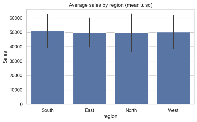
# Bar chart — average sales by region (Seaborn)
plt.figure(figsize=(7,4))
sns.barplot(x='region', y='sales', data=demo_df, estimator=np.mean, errorbar='sd')
plt.title('Average sales by region (mean ± sd)')
plt.ylabel('Sales')
plt.show()
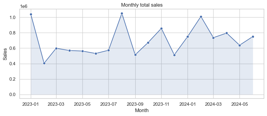
# Line chart — monthly sales trend
monthly_demo = demo_df.groupby(demo_df['date'].dt.to_period('M'))['sales'].sum().reset_index()
monthly_demo['date'] = monthly_demo['date'].dt.to_timestamp()

plt.figure(figsize=(9,4))
sns.lineplot(x='date', y='sales', data=monthly_demo, marker='o')
plt.fill_between(monthly_demo['date'], monthly_demo['sales'], alpha=0.15)
plt.title('Monthly total sales')
plt.ylabel('Sales')
plt.xlabel('Month')
plt.tight_layout()
plt.show()
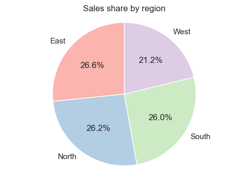
# Pie chart — sales share by region
region_sales = demo_df.groupby('region')['sales'].sum()
plt.figure(figsize=(6,4))
plt.pie(region_sales, labels=region_sales.index, autopct='%1.1f%%', startangle=90, colors=plt.cm.Pastel1.colors)
plt.title('Sales share by region')
plt.axis('equal')
plt.show()
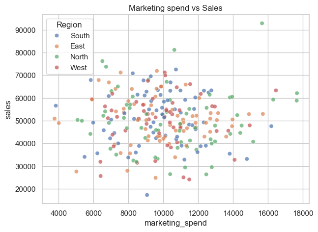
# Scatter plot — marketing spend vs sales (colored by region)
plt.figure(figsize=(7,5))
sns.scatterplot(x='marketing_spend', y='sales', hue='region', data=demo_df, alpha=0.7)
plt.title('Marketing spend vs Sales')
plt.legend(title='Region')
plt.show()
# Heatmap — correlation between numeric features
plt.figure(figsize=(5,4))
corr_demo = demo_df[['sales','profit','marketing_spend','customer_rating']].corr()
sns.heatmap(corr_demo, annot=True, cmap='coolwarm', fmt='.2f', linewidths=0.4)
plt.title('Correlation heatmap')
plt.show()
# Pairplot — pairwise relationships (quick overview)
sns.pairplot(demo_df[['sales','profit','marketing_spend','customer_rating']], corner=True)
plt.suptitle('Pairplot — numeric features', y=1.02)
plt.show()
# Business dashboard preview — Plotly (guarded)
try:
    import plotly.express as px
except Exception:
    print("Plotly not installed — install with: pip install plotly")
else:
    small = demo_df.groupby([demo_df['date'].dt.to_period('M').astype(str),'region'])['sales'].sum().reset_index()
    small['date'] = pd.to_datetime(small['date'])

    fig = px.bar(small, x='date', y='sales', color='region', barmode='group', title='Monthly sales by region')
    fig.update_layout(xaxis_title='Month', yaxis_title='Sales')
    fig.show()
Learning objectives#
By the end of this section you will be able to:
Create common visualizations using Matplotlib and Seaborn.
Interpret plot types and choose the appropriate visualization for business questions.
Customize visual elements (titles, labels, legends, colors) for clear communication.
Setup and dummy dataset#
A small synthetic dataset is used in examples to illustrate plot types and patterns. The executable code cells contain the actual data generation used for figures in this notebook.
Core plot types covered#
This notebook demonstrates:
Distribution plots (histogram, KDE, ECDF)
Categorical comparisons (bar, box, violin, swarm)
Relationship plots (scatter, regression, joint, pair)
Matrix-style summaries (heatmap, clustermap)
Time series and stacked area/bar charts
Interactive previews using Plotly (optional)
Refer to the executable cells that follow for code you can run and adapt.
Interactive Plotly examples#
This section contains optional interactive examples using Plotly. If Plotly is not installed in your environment, the notebook will indicate how to install it.
Setup (Plotly demo)#
The demo uses a small synthetic dataset and shows how to create interactive line, bar, scatter and pie charts, and how to combine them into a simple dashboard layout.
# Setup: imports and synthetic dataset
import numpy as np
import pandas as pd
import matplotlib.pyplot as plt
import seaborn as sns

# Consistent style
sns.set(style="whitegrid", palette="Set2")
np.random.seed(42)

# Synthetic dataset (300 rows)
n = 300
# use 'ME' for month-end frequency to avoid pandas FutureWarning
dates = pd.date_range("2023-01-01", periods=24, freq="ME")

df = pd.DataFrame({
    "sales": np.random.normal(50000, 12000, n).clip(2000),
    "profit": np.random.normal(8000, 3000, n).clip(0),
    "marketing_spend": np.random.normal(10000, 2500, n).clip(100),
    "customer_rating": np.round(np.random.uniform(1, 5, n), 2),
    "region": np.random.choice(["North", "South", "East", "West"], n),
    "product_category": np.random.choice(["A", "B", "C"], n),
    "date": np.random.choice(dates, n)
})

df['month'] = df['date'].dt.to_period('M').astype(str)

df.head()
| sales | profit | marketing_spend | customer_rating | region | product_category | date | month | |
|---|---|---|---|---|---|---|---|---|
| 0 | 55960.569836 | 5513.014967 | 11892.471542 | 1.64 | South | C | 2024-06-30 | 2024-06 |
| 1 | 48340.828386 | 6319.456879 | 7694.586690 | 4.27 | West | B | 2023-03-31 | 2023-03 |
| 2 | 57772.262457 | 10241.880815 | 12174.014800 | 4.33 | South | B | 2024-05-31 | 2024-05 |
| 3 | 68276.358277 | 9831.110796 | 13389.094647 | 3.03 | East | B | 2023-04-30 | 2023-04 |
| 4 | 47190.159503 | 7937.295218 | 11033.587258 | 1.03 | North | C | 2023-04-30 | 2023-04 |
Matplotlib & Seaborn — Example plot types#
Below are examples of common plot types you can create with Matplotlib and Seaborn. Each code cell uses the synthetic df created above so you can run and inspect the resulting diagrams.
## ⓘ Foundational Concepts

This section introduces the essential plotting patterns and dataset setup used throughout the notebook.
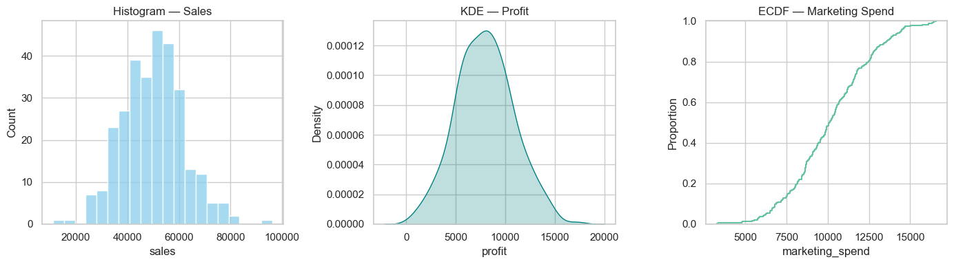
# Distribution plots: histogram, KDE, ECDF, rug
plt.figure(figsize=(14,4))
plt.subplot(1,3,1)
sns.histplot(df['sales'], bins=20, kde=False, color='skyblue')
plt.title('Histogram — Sales')
plt.subplot(1,3,2)
sns.kdeplot(df['profit'], fill=True, color='teal')
plt.title('KDE — Profit')
plt.subplot(1,3,3)
sns.ecdfplot(df['marketing_spend'], complementary=False)
plt.title('ECDF — Marketing Spend')
plt.tight_layout()
plt.show()
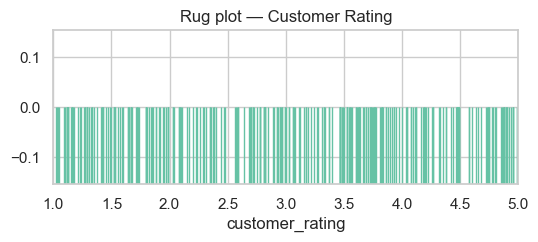
# Rug plot (compact)
plt.figure(figsize=(6,2))
sns.rugplot(df['customer_rating'], height=0.5)
plt.title('Rug plot — Customer Rating')
plt.xlim(1,5)
plt.show()
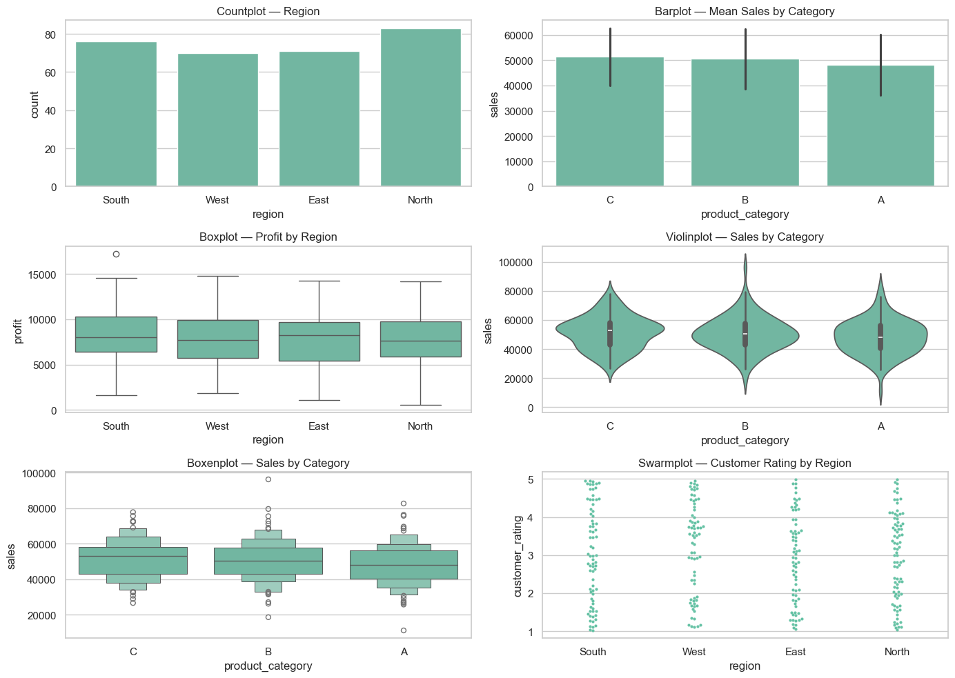
Categorical plots#
Bar, count, box, violin and swarm plots — useful for comparing categories and spotting outliers.
# Categorical plot examples
plt.figure(figsize=(14,10))

plt.subplot(3,2,1)
sns.countplot(x='region', data=df)
plt.title('Countplot — Region')

plt.subplot(3,2,2)
# use errorbar instead of deprecated `ci`
sns.barplot(x='product_category', y='sales', data=df, estimator=np.mean, errorbar='sd')
plt.title('Barplot — Mean Sales by Category')

plt.subplot(3,2,3)
sns.boxplot(x='region', y='profit', data=df)
plt.title('Boxplot — Profit by Region')

plt.subplot(3,2,4)
sns.violinplot(x='product_category', y='sales', data=df)
plt.title('Violinplot — Sales by Category')

plt.subplot(3,2,5)
sns.boxenplot(x='product_category', y='sales', data=df)
plt.title('Boxenplot — Sales by Category')

plt.subplot(3,2,6)
sns.swarmplot(x='region', y='customer_rating', data=df, size=3)
plt.title('Swarmplot — Customer Rating by Region')

plt.tight_layout()
plt.show()
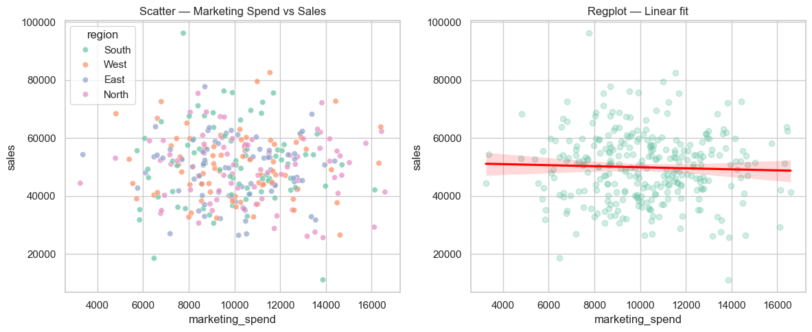
Relationship and regression plots#
Scatter, regression, joint and pair plots to explore relationships between numerical variables.
# Relationship / regression examples
plt.figure(figsize=(12,5))
plt.subplot(1,2,1)
sns.scatterplot(x='marketing_spend', y='sales', hue='region', data=df, alpha=0.7)
plt.title('Scatter — Marketing Spend vs Sales')
plt.subplot(1,2,2)
sns.regplot(x='marketing_spend', y='sales', data=df, scatter_kws={'alpha':0.3}, line_kws={'color':'red'})
plt.title('Regplot — Linear fit')
plt.tight_layout()
plt.show()
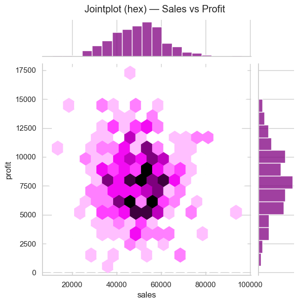
# Jointplot (hex) for density + marginals
sns.jointplot(x='sales', y='profit', data=df, kind='hex', height=6, color='purple')
plt.suptitle('Jointplot (hex) — Sales vs Profit', y=1.02)
plt.show()
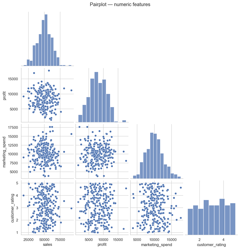
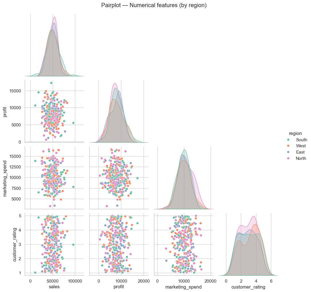
# Pairplot for quick pairwise relationships
sns.pairplot(df[['sales','profit','marketing_spend','customer_rating','region']], hue='region', palette='Set2', corner=True)
plt.suptitle('Pairplot — Numerical features (by region)', y=1.02)
plt.show()
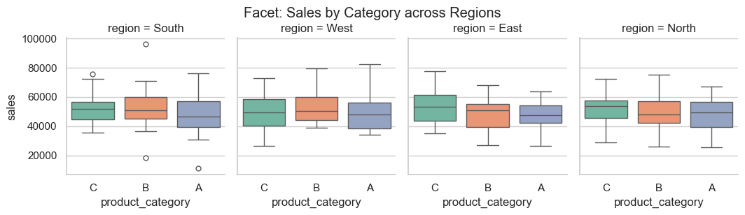
Matrix & grid plots#
Heatmaps, clustermaps and faceted grids for matrix-style summaries.
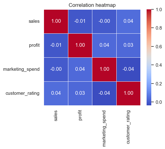
# Heatmap + Clustermap + Facet example
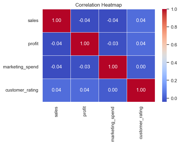
corr = df[['sales','profit','marketing_spend','customer_rating']].corr()
plt.figure(figsize=(6,4))
sns.heatmap(corr, annot=True, cmap='coolwarm', fmt='.2f', linewidths=0.5)
plt.title('Correlation Heatmap')
plt.show()
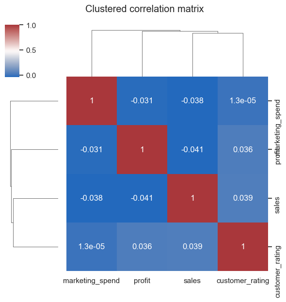
# Clustermap (separate figure)
sns.clustermap(corr, cmap='vlag', annot=True, figsize=(6,6))
plt.suptitle('Clustered correlation matrix', y=1.05)
plt.show()
# Facet / CatGrid example: sales distribution by product category and region
sns.catplot(x='product_category', y='sales', col='region', data=df, kind='box', height=3, aspect=0.9)
plt.suptitle('Facet: Sales by Category across Regions', y=1.02)
plt.show()
/var/folders/93/7lt42x5j7m39kz7wxbcghvrm0000gn/T/ipykernel_13105/3859097564.py:14: FutureWarning:

Passing `palette` without assigning `hue` is deprecated and will be removed in v0.14.0. Assign the `x` variable to `hue` and set `legend=False` for the same effect.

  sns.catplot(x='product_category', y='sales', col='region', data=df, kind='box', height=3, aspect=0.9, palette='Set2')
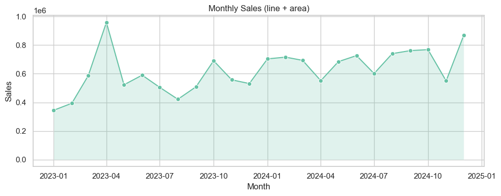
Time series & area / stacked plots#
Examples for temporal summaries and stacked area/bar charts.
# Time series examples: monthly aggregation + area/stacked
monthly = df.groupby(df['date'].dt.to_period('M'))['sales'].sum().reset_index()
monthly['date'] = monthly['date'].dt.to_timestamp()
plt.figure(figsize=(10,4))
sns.lineplot(x='date', y='sales', data=monthly, marker='o')
plt.fill_between(monthly['date'], monthly['sales'], alpha=0.2)
plt.title('Monthly Sales (line + area)')
plt.ylabel('Sales')
plt.xlabel('Month')
plt.tight_layout()
plt.show()
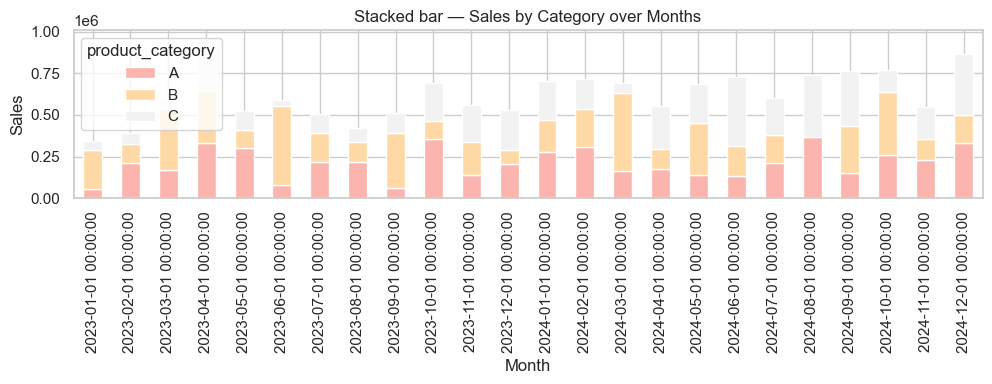
# Stacked bar: sales by category over months
monthly_cat = df.groupby([df['date'].dt.to_period('M').astype(str),'product_category'])['sales'].sum().unstack(fill_value=0)
monthly_cat.index = pd.to_datetime(monthly_cat.index)
ax = monthly_cat.plot(kind='bar', stacked=True, figsize=(10,4), colormap='Pastel1')
ax.set_title('Stacked bar — Sales by Category over Months')
ax.set_xlabel('Month')
ax.set_ylabel('Sales')
plt.tight_layout()
plt.show()
## Interactive Plotly — examples (keeps code warning-free)

Below are interactive equivalents of common charts using Plotly Express and plotly.graph_objects. The small demo dataset below uses `freq='ME'` (month-end) to avoid pandas FutureWarnings.
# Plotly interactive examples (no deprecation warnings)
try:
    import plotly.express as px
    import plotly.graph_objects as go
    from plotly.subplots import make_subplots
except Exception as e:
    print("Plotly is not installed in this environment. To run interactive examples install with: pip install plotly")
else:
    # Demo dataset (month-end frequency)
    np.random.seed(42)
    plotly_df = pd.DataFrame({
        "Month": pd.date_range("2024-01-01", periods=12, freq="ME"),
        "Sales": np.random.randint(30000, 80000, 12),
        "Profit": np.random.randint(5000, 15000, 12),
        "Region": np.random.choice(["North", "South", "East", "West"], 12)
    })

    # Interactive line
    fig = px.line(plotly_df, x="Month", y="Sales", title="Monthly Sales Trend", markers=True,
                  color_discrete_sequence=["#1f77b4"])
    fig.update_layout(xaxis_title="Month", yaxis_title="Sales", hovermode="x unified")
    fig.show()

    # Interactive bar
    fig = px.bar(plotly_df, x="Region", y="Profit", color="Region",
                 title="Profit by Region", text_auto=True,
                 color_discrete_sequence=px.colors.qualitative.Vivid)
    fig.update_layout(xaxis_title="Region", yaxis_title="Profit", showlegend=False)
    fig.show()

    # Interactive scatter
    fig = px.scatter(plotly_df, x="Sales", y="Profit", color="Region", size="Profit",
                     hover_name="Month", title="Sales vs Profit by Region",
                     color_discrete_sequence=px.colors.qualitative.Set2)
    fig.update_layout(xaxis_title="Sales", yaxis_title="Profit", legend_title="Region")
    fig.show()

    # Interactive pie
    fig = px.pie(plotly_df, values="Sales", names="Region", title="Sales Share by Region",
                 color_discrete_sequence=px.colors.qualitative.Pastel)
    fig.update_traces(textinfo="percent+label")
    fig.show()

    # Combined dashboard (subplots)
    fig = make_subplots(rows=2, cols=2,
                        subplot_titles=("Sales Trend", "Profit by Region", "Sales vs Profit", "Sales Share"))
    fig.add_trace(go.Scatter(x=plotly_df["Month"], y=plotly_df["Sales"], name="Sales", mode="lines+markers"), row=1, col=1)
    fig.add_trace(go.Bar(x=plotly_df["Region"], y=plotly_df["Profit"], name="Profit by Region"), row=1, col=2)
    fig.add_trace(go.Scatter(x=plotly_df["Sales"], y=plotly_df["Profit"], mode="markers", name="Sales vs Profit",
                             marker=dict(size=10, color='teal', opacity=0.6)), row=2, col=1)
    fig.add_trace(go.Pie(labels=plotly_df["Region"], values=plotly_df["Sales"], name="Sales Share"), row=2, col=2)
    fig.update_layout(height=800, width=1000, title_text="Interactive Business Dashboard", showlegend=False, template="plotly_white")
    fig.show()
Plotly is not installed in this environment. To run interactive examples install with: pip install plotly
## Quick gallery — ready-to-copy examples

The cell below renders small thumbnails of common Matplotlib / Seaborn plot types so you can quickly copy/paste the pattern into your own analysis. All plotting calls avoid deprecated arguments (no `ci=...`, no `palette` without `hue`, `freq='ME'` for month-end dates).
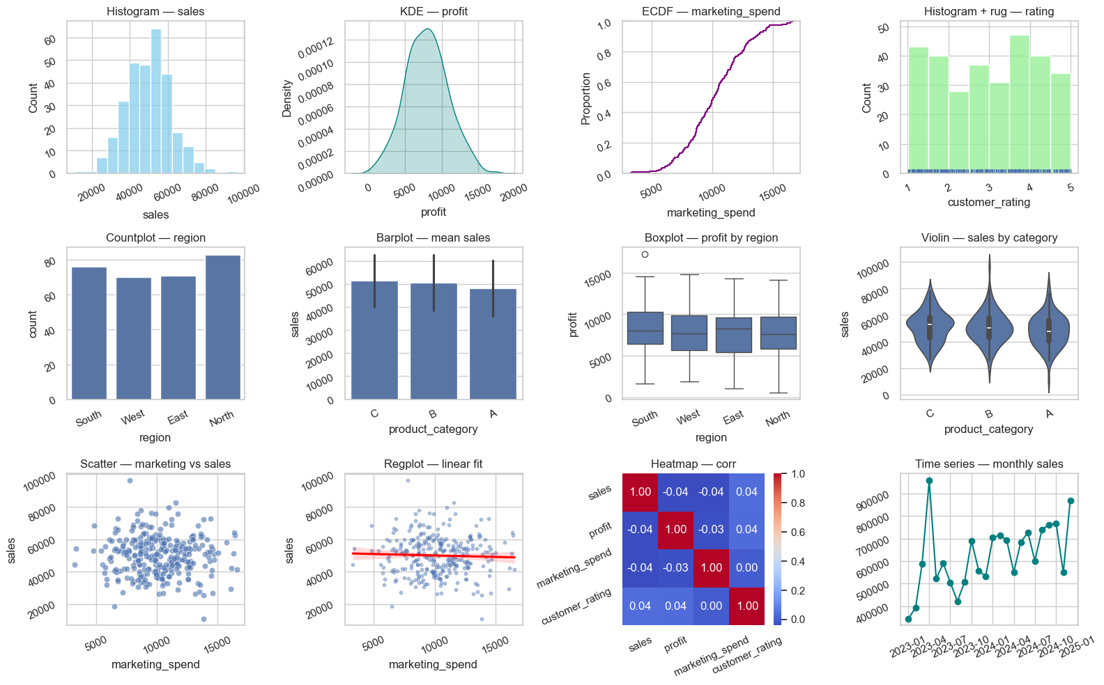
# Compact gallery: 3 x 4 thumbnails

sns.set_theme(style='whitegrid')
fig, axes = plt.subplots(3, 4, figsize=(16, 10))
axes = axes.flatten()

# 1 Histogram
sns.histplot(df['sales'], bins=15, ax=axes[0], color='skyblue')
axes[0].set_title('Histogram — sales')

# 2 KDE
sns.kdeplot(df['profit'], fill=True, ax=axes[1], color='teal')
axes[1].set_title('KDE — profit')

# 3 ECDF
sns.ecdfplot(df['marketing_spend'], ax=axes[2], color='purple')
axes[2].set_title('ECDF — marketing_spend')

# 4 Rug
sns.histplot(df['customer_rating'], bins=8, ax=axes[3], color='lightgreen')
sns.rugplot(df['customer_rating'], ax=axes[3])
axes[3].set_title('Histogram + rug — rating')

# 5 Countplot
sns.countplot(x='region', data=df, ax=axes[4])
axes[4].set_title('Countplot — region')

# 6 Barplot (mean + sd via errorbar)
sns.barplot(x='product_category', y='sales', data=df, estimator=np.mean, errorbar='sd', ax=axes[5])
axes[5].set_title('Barplot — mean sales')

# 7 Boxplot
sns.boxplot(x='region', y='profit', data=df, ax=axes[6])
axes[6].set_title('Boxplot — profit by region')

# 8 Violin
sns.violinplot(x='product_category', y='sales', data=df, ax=axes[7])
axes[7].set_title('Violin — sales by category')

# 9 Scatter
sns.scatterplot(x='marketing_spend', y='sales', data=df, ax=axes[8], alpha=0.6)
axes[8].set_title('Scatter — marketing vs sales')

# 10 Regplot
sns.regplot(x='marketing_spend', y='sales', data=df, ax=axes[9], scatter_kws={'s':10, 'alpha':0.4}, line_kws={'color':'red'})
axes[9].set_title('Regplot — linear fit')

# 11 Heatmap (use small correlation)
corr = df[['sales','profit','marketing_spend','customer_rating']].corr()
sns.heatmap(corr, annot=True, fmt='.2f', cmap='coolwarm', ax=axes[10])
axes[10].set_title('Heatmap — corr')

# 12 Time series (monthly totals)
monthly = df.groupby(df['date'].dt.to_period('M'))['sales'].sum().reset_index()
monthly['date'] = monthly['date'].dt.to_timestamp()
axes[11].plot(monthly['date'], monthly['sales'], marker='o', color='teal')
axes[11].set_title('Time series — monthly sales')
for ax in axes:
    ax.tick_params(labelrotation=25)
plt.tight_layout()
plt.show()
# Setup for quick examples (self-contained)
np.random.seed(1)

demo_n = 250
demo_dates = pd.date_range('2023-01-01', periods=18, freq='ME')

demo_df = pd.DataFrame({
    'date': np.random.choice(demo_dates, demo_n),
    'sales': np.random.normal(50000, 12000, demo_n).clip(1000),
    'profit': np.random.normal(8000, 3000, demo_n).clip(0),
    'marketing_spend': np.random.normal(10000, 2500, demo_n).clip(100),
    'customer_rating': np.round(np.random.uniform(1,5, demo_n),2),
    'region': np.random.choice(['North','South','East','West'], demo_n),
    'product_category': np.random.choice(['A','B','C'], demo_n)
})

demo_df['month'] = demo_df['date'].dt.to_period('M').astype(str)

demo_df.head()