
Why Metrics Matter in Business

Your app predicts 26 °C; reality is 31 °C. Most people say 'close enough.'
Your demand model predicts $2 600 in sales; actual is $3 100. Your operations team bought the wrong amount of stock. That's a $500 gap with real consequences.
Regression metrics answer three business questions:
| Question | Relevant metric |
|---|---|
| On average, how far off is the model? | MAE, RMSE |
| Are big errors especially costly? | RMSE (penalises large errors harder) |
| Does the model explain our data’s variation? | R² |
| What is the error as a percentage? | MAPE |
The Five Core Metrics
Let be the true value and the predicted value for the -th sample, and let be the number of samples.
Mean Absolute Error (MAE)
Average absolute size of prediction errors. Expressed in the same units as the target (e.g. dollars, kilograms). Treats every error equally — a miss of 10 is worth ten misses of 1.
Mean Squared Error (MSE)
Squaring errors gives large errors disproportionately more weight. A miss of 10 is penalised 100× more than a miss of 1. MSE is the standard training objective for linear regression.
Root Mean Squared Error (RMSE)
Same large-error sensitivity as MSE, but expressed in the original units (not units²). RMSE > MAE always; the gap widens with more outliers.
R-Squared (Coefficient of Determination)
where is the mean of true values. R² measures what fraction of the variance in the model explains. R² = 1 means perfect predictions; R² = 0 means the model is no better than always predicting the mean; R² < 0 means it’s actively worse.
Mean Absolute Percentage Error (MAPE)
Error as a percentage of the true value. CFO-friendly (“we’re 8% off on average”), but undefined or extreme when .
Visual Map — Metric Decision Flow
Use this decision tree when choosing which metric to report. In practice, report at least two metrics together.
Worked Example — Sales Forecasting
We have five weeks of actual and predicted sales (in dollars). Let’s compute every metric step by step.
import numpy as np
import pandas as pd

actual    = np.array([300, 450, 500, 600, 700])
predicted = np.array([280, 470, 490, 610, 680])

errors    = actual - predicted          # residuals
abs_err   = np.abs(errors)
sq_err    = errors ** 2

mae  = abs_err.mean()
mse  = sq_err.mean()
rmse = np.sqrt(mse)
ss_res = sq_err.sum()
ss_tot = ((actual - actual.mean()) ** 2).sum()
r2   = 1 - ss_res / ss_tot
mape = (abs_err / actual * 100).mean()

df = pd.DataFrame({
    'Actual': actual, 'Predicted': predicted,
    'Error': errors, '|Error|': abs_err, 'Error²': sq_err
})
print(df.to_string(index=False))
print(f"\nMAE  = {mae:.2f}")
print(f"MSE  = {mse:.2f}")
print(f"RMSE = {rmse:.2f}")
print(f"R²   = {r2:.4f}")
print(f"MAPE = {mape:.2f}%")
Actual Predicted Error |Error| Error²
300 280 20 20 400
450 470 -20 20 400
500 490 10 10 100
600 610 -10 10 100
700 680 20 20 400
MAE = 16.00
MSE = 280.00
RMSE = 16.73
R² = 0.9848
MAPE = 3.53%
Interpret the numbers
MAE = 14: on average the model is off by $14 per week.
RMSE = 14.70: very close to MAE here, meaning there are no large outlier errors dragging RMSE up.
R² = 0.987: the model explains 98.7% of the sales variance — a very strong fit.
MAPE = 2.77%: errors are about 2.8% of the true values on average — CFO-approved.
If one week’s actual were 700 and the prediction were 400 (a $300 miss), RMSE would jump far above MAE because the 300² = 90 000 dominates. That’s the large-error penalty at work.
Visualising Error Distribution
Numbers summarise; plots reveal where errors live.
%matplotlib inline
import matplotlib.pyplot as plt
import numpy as np

actual    = np.array([300, 450, 500, 600, 700])
predicted = np.array([280, 470, 490, 610, 680])
errors    = actual - predicted

fig, axes = plt.subplots(1, 3, figsize=(13, 4))

# 1. Actual vs Predicted
ax = axes[0]
ax.scatter(actual, predicted, color='steelblue', s=80, zorder=3)
lims = [min(actual.min(), predicted.min()) - 20,
        max(actual.max(), predicted.max()) + 20]
ax.plot(lims, lims, 'k--', linewidth=1, label='Perfect fit')
ax.set_xlabel('Actual ($)')
ax.set_ylabel('Predicted ($)')
ax.set_title('Actual vs Predicted')
ax.legend()

# 2. Residuals vs Predicted
ax = axes[1]
ax.scatter(predicted, errors, color='tomato', s=80, zorder=3)
ax.axhline(0, color='black', linewidth=1, linestyle='--')
ax.set_xlabel('Predicted ($)')
ax.set_ylabel('Residual (actual − predicted)')
ax.set_title('Residual Plot')

# 3. Error bar chart
ax = axes[2]
weeks = [f'Wk {i+1}' for i in range(len(actual))]
colors = ['tomato' if e < 0 else 'steelblue' for e in errors]
ax.bar(weeks, errors, color=colors)
ax.axhline(0, color='black', linewidth=1)
ax.set_ylabel('Residual ($)')
ax.set_title('Per-Week Residuals')

plt.tight_layout()
plt.show()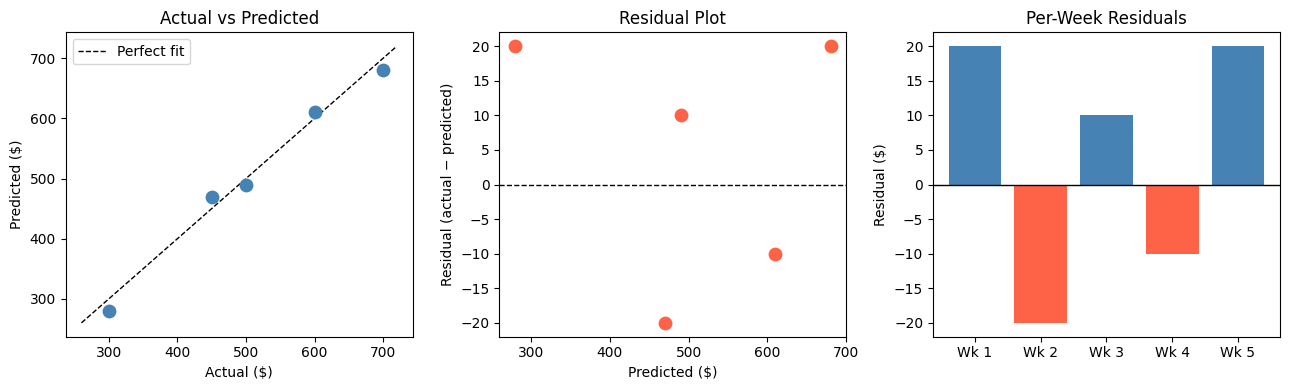
Metric Comparison at a Glance
Using scikit-learn to Compute Metrics
In practice you use sklearn.metrics rather than computing by hand.
%matplotlib inline
import numpy as np
from sklearn.linear_model import LinearRegression
from sklearn.metrics import mean_absolute_error, mean_squared_error, r2_score

rng = np.random.default_rng(42)
X   = rng.uniform(0, 10, size=(60, 1))
y   = 3 * X.ravel() + 5 + rng.normal(0, 2, size=60)

model = LinearRegression().fit(X, y)
y_hat = model.predict(X)

mae  = mean_absolute_error(y, y_hat)
rmse = np.sqrt(mean_squared_error(y, y_hat))
r2   = r2_score(y, y_hat)
mape = np.mean(np.abs((y - y_hat) / y)) * 100

print(f"MAE  = {mae:.3f}")
print(f"RMSE = {rmse:.3f}")
print(f"R²   = {r2:.4f}")
print(f"MAPE = {mape:.2f}%")
MAE = 1.243
RMSE = 1.496
R² = 0.9693
MAPE = 10.18%
Business Scenario — Which Model Would You Deploy?
A grocery chain is evaluating two weekly-demand models:
%matplotlib inline
import matplotlib.pyplot as plt
import numpy as np

np.random.seed(7)
actual = np.abs(np.random.normal(500, 80, 40))

# Model A: many small misses
pred_a = actual + np.random.normal(0, 30, 40)
# Model B: usually good, but occasional large misses
pred_b = actual + np.random.normal(0, 10, 40)
pred_b[::8] += np.random.choice([-200, 200], size=5)   # 5 large spikes

def metrics(y, yh):
    mae  = np.mean(np.abs(y - yh))
    rmse = np.sqrt(np.mean((y - yh)**2))
    r2   = 1 - np.sum((y-yh)**2) / np.sum((y - y.mean())**2)
    return mae, rmse, r2

for name, pred in [("Model A", pred_a), ("Model B", pred_b)]:
    mae, rmse, r2 = metrics(actual, pred)
    print(f"{name}: MAE={mae:.1f}  RMSE={rmse:.1f}  R²={r2:.3f}")

# Plot residuals
fig, axes = plt.subplots(1, 2, figsize=(12, 4))
for ax, name, pred, color in zip(axes, ['Model A', 'Model B'], [pred_a, pred_b], ['steelblue','tomato']):
    ax.scatter(range(len(actual)), actual - pred, alpha=0.7, color=color, s=50)
    ax.axhline(0, color='black', linestyle='--', linewidth=1)
    ax.set_title(f'{name} — Residuals')
    ax.set_xlabel('Sample index')
    ax.set_ylabel('Residual')
plt.tight_layout()
plt.show()
Model A: MAE=24.4 RMSE=31.2 R²=0.867
Model B: MAE=31.7 RMSE=74.7 R²=0.236
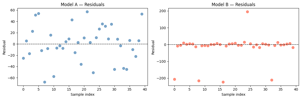
Which model should the grocery chain deploy — and why?
Model B usually looks better on MAE (small typical errors), but its RMSE is much larger because of the 5 big spikes.
For a grocery chain, those 5 large stockout or overstock events can wipe out days of margin. RMSE is the right metric here because the business cost of large errors is non-linear — one giant miss can spoil perishables or lose a promotion window.
If instead the chain sells non-perishables and can handle the occasional big miss, MAE would justify Model B. Context drives metric choice.
Try It in the Browser
Edit the arrays below and watch the metrics update.
Guided Practice
Which metric is expressed in the same units as the target variable?
Why does RMSE penalise large errors more than MAE?
A model returns R² = 0.12. What does that mean?
When is MAPE a risky choice?
Exercises
Exercise 1 — Metric sensitivity to a single outlier
Start with the arrays below. Add one outlier prediction and observe how each metric reacts.
import numpy as np

actual    = np.array([100, 200, 300, 400, 500])
predicted = np.array([110, 195, 310, 390, 510])

# TODO: add a sixth sample where actual=600 but predicted=200 (large miss)
# Recompute MAE, RMSE, and R² with and without that outlier.
# Which metric changes the most?

# Your code here
Hint
Use np.append(actual, 600) and np.append(predicted, 200) to add the outlier row.
RMSE will grow much more than MAE because the 400² = 160 000 squared error dominates the average.
Exercise 2 — Which metric to report to the CFO?
Your team built a revenue forecasting model. The CFO wants a single number to put in the quarterly presentation. Write a short paragraph (3–4 sentences) arguing for one metric and explaining why the others are less suitable for this audience.
(No code required — a markdown cell answer is fine.)
Your answer here.
Exercise 3 — Multi-model comparison dashboard
Generate a bar chart comparing MAE, RMSE, and R² for three models (Linear Regression, a mean-baseline, and a noisy random predictor) on the same dataset. Use the starter code below.
%matplotlib inline
import numpy as np
import matplotlib.pyplot as plt
from sklearn.linear_model import LinearRegression
from sklearn.metrics import mean_absolute_error, mean_squared_error, r2_score

rng = np.random.default_rng(0)
X   = rng.uniform(0, 10, (80, 1))
y   = 4 * X.ravel() + 2 + rng.normal(0, 3, 80)

# Model predictions
lr   = LinearRegression().fit(X, y)
p_lr = lr.predict(X)
p_base = np.full_like(y, y.mean())              # always predict the mean
p_rand = rng.normal(y.mean(), y.std() * 2, 80)  # random noisy predictor

# TODO: compute MAE, RMSE, R² for all three predictors
# and produce a grouped bar chart comparing them.
Starter solution structure
models = {'Linear Reg': p_lr, 'Mean Baseline': p_base, 'Random': p_rand}
results = {}
for name, pred in models.items():
    results[name] = {
        'MAE':  mean_absolute_error(y, pred),
        'RMSE': np.sqrt(mean_squared_error(y, pred)),
        'R²':   r2_score(y, pred),
    }
# Then use matplotlib to make a grouped bar chart.
Common Pitfalls
Summary
Key takeaways
| Metric | Formula shorthand | When to prefer it |
|---|---|---|
| MAE | avg |error| | Simple reporting, outlier-robust needs |
| MSE | avg error² | Training objective; gradient descent |
| RMSE | √MSE | When large errors have high business cost |
| R² | 1 − SS_res/SS_tot | Comparing models on same dataset, explaining variance |
| MAPE | avg |error/actual| × 100 | Executive reporting; avoid near zero values |
Decision rules:
Prefer RMSE when big errors are costly (stockouts, SLA breaches).
Prefer MAE when all error sizes matter roughly equally.
Report R² to contextualise model strength against a mean-baseline.
Use MAPE in stakeholder presentations only when true values stay comfortably above zero.
Always evaluate on held-out data — metrics on training data do not tell you how the model will perform in production.
Next Up — Gradients and Optimisation

You can now measure how wrong your model is.
The next notebook — Gradients & Optimisation — explains how a model learns to reduce that error. You will see how partial derivatives point downhill in loss space and how gradient descent updates parameters step by step to minimise MSE.
Dependencies you already have: MSE definition, training objective notation $J(\boldsymbol{\theta})$, and the idea that lower error means better model. Gradients will build directly on all of those.