
Lab — Churn Prediction
Lab objectives
In this end-to-end lab you will:
Load and explore a telecom churn dataset.
Perform feature engineering (encode categoricals, scale numerics).
Handle class imbalance with
class_weight='balanced'.Train and compare Logistic Regression, Naive Bayes, and a Random Forest baseline.
Evaluate each model with confusion matrix, classification report, ROC, and PR curves.
Select and justify a business-optimal decision threshold.
Interpret logistic regression coefficients as churn risk factors.
Summarise findings in a short business recommendation.

Business context — SuperTel
SuperTel is a telecom company with 7,000 customers. Monthly churn rate is around 15 %. Each churned customer costs ~GBP 500 in acquisition cost to replace.
The retention team can proactively offer a discount package (cost: GBP 50 per customer contacted). If the offer is given to a genuine churner, they stay with 70 % probability (saving GBP 500). If given to a loyal customer, the cost is wasted.
Your model’s predictions will determine who gets the offer. The business wants:
High recall: do not miss too many churners
Acceptable precision: do not waste too many retention offers
Step 1 — Load and Explore the Data
%matplotlib inline
import numpy as np
import pandas as pd
import matplotlib.pyplot as plt
from sklearn.datasets import make_classification
# Synthetic telecom churn dataset
np.random.seed(42)
n = 1000
tenure = np.random.gamma(3, 10, n).clip(1, 72).astype(int)
monthly_charges = np.random.normal(65, 20, n).clip(20, 120)
total_charges = tenure * monthly_charges + np.random.normal(0, 50, n)
tech_support = np.random.choice([0, 1], n, p=[0.6, 0.4])
contract_type = np.random.choice([0, 1, 2], n, p=[0.45, 0.3, 0.25]) # 0=monthly,1=1yr,2=2yr
num_complaints = np.random.poisson(1.2, n)
# Churn probability driven by features
log_odds = (-2.5
- 0.04 * tenure
+ 0.02 * monthly_charges
- 0.6 * tech_support
- 1.2 * contract_type
+ 0.5 * num_complaints)
churn_prob = 1 / (1 + np.exp(-log_odds))
churn = (np.random.uniform(0, 1, n) < churn_prob).astype(int)
df = pd.DataFrame({
'tenure': tenure,
'monthly_charges': monthly_charges.round(2),
'total_charges': total_charges.round(2),
'tech_support': tech_support,
'contract_type': contract_type,
'num_complaints': num_complaints,
'churn': churn
})
print(f'Dataset shape: {df.shape}')
print(f'Churn rate: {df.churn.mean():.1%}')
print()
print(df.describe().round(2))
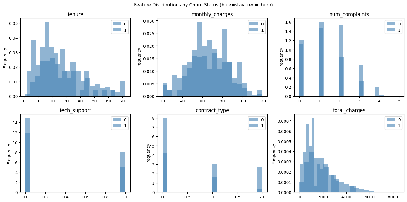
# Feature distributions by churn status
fig, axes = plt.subplots(2, 3, figsize=(14, 7))
features = ['tenure', 'monthly_charges', 'num_complaints', 'tech_support', 'contract_type', 'total_charges']
for ax, feat in zip(axes.ravel(), features):
df.groupby('churn')[feat].plot(kind='hist', ax=ax, bins=20, alpha=0.6, legend=True,
color=['steelblue', 'red'], density=True)
ax.set_title(feat)
ax.set_xlabel('')
plt.suptitle('Feature Distributions by Churn Status (blue=stay, red=churn)', fontsize=11)
plt.tight_layout()
plt.show()Dataset shape: (1000, 7)
Churn rate: 7.5%
tenure monthly_charges total_charges tech_support contract_type \
count 1000.00 1000.00 1000.00 1000.00 1000.00
mean 30.03 64.76 1963.79 0.40 0.80
std 16.42 19.60 1289.46 0.49 0.82
min 1.00 20.00 -27.60 0.00 0.00
25% 18.00 51.03 990.68 0.00 0.00
50% 27.00 65.07 1701.26 0.00 1.00
75% 39.00 78.84 2573.12 1.00 2.00
max 72.00 120.00 8529.39 1.00 2.00
num_complaints churn
count 1000.00 1000.00
mean 1.13 0.08
std 0.98 0.26
min 0.00 0.00
25% 0.00 0.00
50% 1.00 0.00
75% 2.00 0.00
max 5.00 1.00
Step 2 — Feature Engineering and Preprocessing
%matplotlib inline
import numpy as np
import pandas as pd
import matplotlib.pyplot as plt
from sklearn.model_selection import train_test_split
from sklearn.preprocessing import StandardScaler
# Using df from previous cell
feature_cols = ['tenure', 'monthly_charges', 'total_charges', 'tech_support',
'contract_type', 'num_complaints']
X = df[feature_cols].values
y = df['churn'].values
X_train, X_test, y_train, y_test = train_test_split(
X, y, test_size=0.2, random_state=42, stratify=y
)
scaler = StandardScaler()
X_train_s = scaler.fit_transform(X_train)
X_test_s = scaler.transform(X_test)
print(f'Train: {X_train.shape}, Test: {X_test.shape}')
print(f'Train churn rate: {y_train.mean():.1%}')
print(f'Test churn rate: {y_test.mean():.1%}')
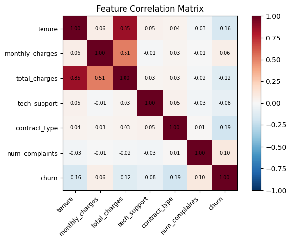
# Correlation heatmap
corr = pd.DataFrame(X, columns=feature_cols).assign(churn=y).corr()
fig, ax = plt.subplots(figsize=(7, 5))
im = ax.imshow(corr, cmap='RdBu_r', vmin=-1, vmax=1)
ax.set_xticks(range(len(corr.columns)))
ax.set_yticks(range(len(corr.columns)))
ax.set_xticklabels(corr.columns, rotation=45, ha='right', fontsize=9)
ax.set_yticklabels(corr.columns, fontsize=9)
for i in range(len(corr.columns)):
for j in range(len(corr.columns)):
ax.text(j, i, f'{corr.iloc[i, j]:.2f}', ha='center', va='center', fontsize=7)
plt.colorbar(im)
ax.set_title('Feature Correlation Matrix')
plt.tight_layout()
plt.show()Train: (800, 6), Test: (200, 6)
Train churn rate: 7.5%
Test churn rate: 7.5%
Step 3 — Train and Compare Models
%matplotlib inline
import numpy as np
import matplotlib.pyplot as plt
from sklearn.linear_model import LogisticRegression
from sklearn.naive_bayes import GaussianNB
from sklearn.ensemble import RandomForestClassifier
from sklearn.metrics import (classification_report, roc_auc_score,
average_precision_score, f1_score, matthews_corrcoef)
models = {
'Logistic Regression': LogisticRegression(class_weight='balanced', max_iter=1000, random_state=42),
'Gaussian NB': GaussianNB(),
'Random Forest': RandomForestClassifier(n_estimators=100, class_weight='balanced', random_state=42),
}
results = {}
for name, m in models.items():
X_tr = X_train_s if name != 'Random Forest' else X_train
X_te = X_test_s if name != 'Random Forest' else X_test
m.fit(X_tr, y_train)
y_pred = m.predict(X_te)
probs = m.predict_proba(X_te)[:, 1]
results[name] = {
'model': m, 'X_te': X_te,
'F1': f1_score(y_test, y_pred, zero_division=0),
'AUC-ROC': roc_auc_score(y_test, probs),
'AUC-PR': average_precision_score(y_test, probs),
'MCC': matthews_corrcoef(y_test, y_pred),
'probs': probs, 'y_pred': y_pred,
}
print(f'--- {name} ---')
print(classification_report(y_test, y_pred, target_names=['Stay', 'Churn'], zero_division=0))
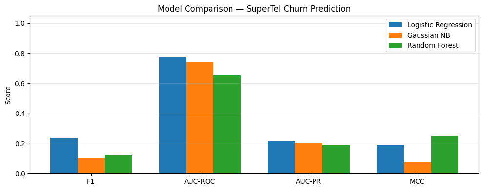
# Comparison bar chart
metrics = ['F1', 'AUC-ROC', 'AUC-PR', 'MCC']
x = np.arange(len(metrics))
width = 0.25
fig, ax = plt.subplots(figsize=(10, 4))
for i, (name, vals) in enumerate(results.items()):
ax.bar(x + (i - 1) * width, [vals[m] for m in metrics], width, label=name)
ax.set_xticks(x); ax.set_xticklabels(metrics)
ax.set_ylim(0, 1.05)
ax.set_ylabel('Score')
ax.set_title('Model Comparison — SuperTel Churn Prediction')
ax.legend()
ax.grid(True, axis='y', alpha=0.3)
plt.tight_layout()
plt.show()--- Logistic Regression ---
precision recall f1-score support
Stay 0.96 0.68 0.80 185
Churn 0.14 0.67 0.24 15
accuracy 0.68 200
macro avg 0.55 0.67 0.52 200
weighted avg 0.90 0.68 0.76 200
--- Gaussian NB ---
precision recall f1-score support
Stay 0.93 0.98 0.95 185
Churn 0.20 0.07 0.10 15
accuracy 0.91 200
macro avg 0.56 0.52 0.53 200
weighted avg 0.87 0.91 0.89 200
--- Random Forest ---
precision recall f1-score support
Stay 0.93 1.00 0.96 185
Churn 1.00 0.07 0.12 15
accuracy 0.93 200
macro avg 0.96 0.53 0.54 200
weighted avg 0.93 0.93 0.90 200
/Volumes/MacSSD/01_Projects/Chandravesh-ML-Research/projects/jupyter-books/.venv/lib/python3.10/site-packages/sklearn/linear_model/_linear_loss.py:200: RuntimeWarning: divide by zero encountered in matmul
  raw_prediction = X @ weights + intercept
/Volumes/MacSSD/01_Projects/Chandravesh-ML-Research/projects/jupyter-books/.venv/lib/python3.10/site-packages/sklearn/linear_model/_linear_loss.py:200: RuntimeWarning: overflow encountered in matmul
  raw_prediction = X @ weights + intercept
/Volumes/MacSSD/01_Projects/Chandravesh-ML-Research/projects/jupyter-books/.venv/lib/python3.10/site-packages/sklearn/linear_model/_linear_loss.py:200: RuntimeWarning: invalid value encountered in matmul
  raw_prediction = X @ weights + intercept
/Volumes/MacSSD/01_Projects/Chandravesh-ML-Research/projects/jupyter-books/.venv/lib/python3.10/site-packages/sklearn/utils/extmath.py:203: RuntimeWarning: divide by zero encountered in matmul
  ret = a @ b
/Volumes/MacSSD/01_Projects/Chandravesh-ML-Research/projects/jupyter-books/.venv/lib/python3.10/site-packages/sklearn/utils/extmath.py:203: RuntimeWarning: overflow encountered in matmul
  ret = a @ b
/Volumes/MacSSD/01_Projects/Chandravesh-ML-Research/projects/jupyter-books/.venv/lib/python3.10/site-packages/sklearn/utils/extmath.py:203: RuntimeWarning: invalid value encountered in matmul
  ret = a @ b
Step 4 — ROC and PR Curves
%matplotlib inline
import matplotlib.pyplot as plt
from sklearn.metrics import roc_curve, precision_recall_curve

fig, axes = plt.subplots(1, 2, figsize=(13, 5))

axes[0].plot([0, 1], [0, 1], 'k--', label='Random')
for name, r in results.items():
    fpr, tpr, _ = roc_curve(y_test, r['probs'])
    axes[0].plot(fpr, tpr, linewidth=2, label=f'{name} (AUC={r["AUC-ROC"]:.3f})')
axes[0].set_xlabel('FPR (1 - Specificity)')
axes[0].set_ylabel('TPR (Recall)')
axes[0].set_title('ROC Curves')
axes[0].legend(fontsize=8)
axes[0].grid(True)

baseline_pr = y_test.mean()
axes[1].axhline(baseline_pr, color='k', linestyle='--', label=f'Baseline (AP={baseline_pr:.2f})')
for name, r in results.items():
    prec, rec, _ = precision_recall_curve(y_test, r['probs'])
    axes[1].plot(rec, prec, linewidth=2, label=f'{name} (AP={r["AUC-PR"]:.3f})')
axes[1].set_xlabel('Recall')
axes[1].set_ylabel('Precision')
axes[1].set_title('Precision-Recall Curves')
axes[1].legend(fontsize=8)
axes[1].grid(True)

plt.suptitle('SuperTel Churn Model Evaluation', fontsize=12)
plt.tight_layout()
plt.show()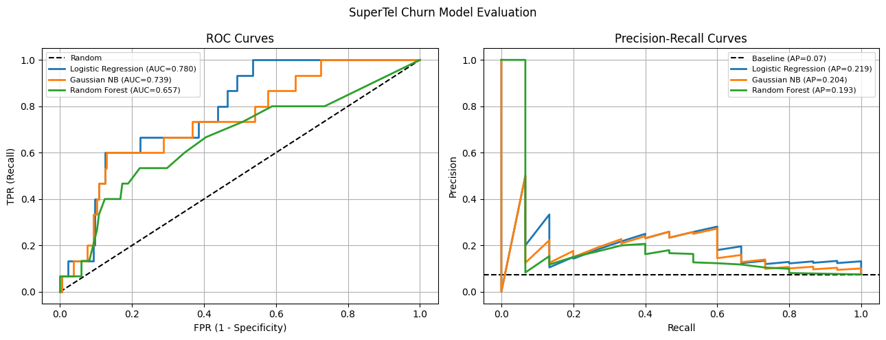
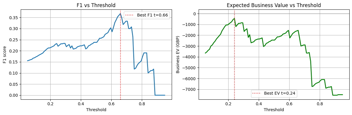
Step 5 — Threshold Selection for Business Value
%matplotlib inline
import numpy as np
import matplotlib.pyplot as plt
from sklearn.metrics import precision_score, recall_score, f1_score

# Use Logistic Regression
probs_lr = results['Logistic Regression']['probs']

# Business value model
# True Positive (caught churner, gave offer): 0.7 * 500 - 50 = +300
# False Positive (gave offer to loyal customer): -50
# False Negative (missed churner): -500
# True Negative: 0
tp_value, fp_cost, fn_cost = 300, 50, 500

thresholds = np.linspace(0.05, 0.95, 100)
f1s, business_evs = [], []

for t in thresholds:
    y_pred_t = (probs_lr >= t).astype(int)
    tp = ((y_pred_t == 1) & (y_test == 1)).sum()
    fp = ((y_pred_t == 1) & (y_test == 0)).sum()
    fn = ((y_pred_t == 0) & (y_test == 1)).sum()
    ev = tp * tp_value - fp * fp_cost - fn * fn_cost
    f1s.append(f1_score(y_test, y_pred_t, zero_division=0))
    business_evs.append(ev)

best_f1_t = thresholds[np.argmax(f1s)]
best_ev_t = thresholds[np.argmax(business_evs)]

print(f'Threshold maximising F1: {best_f1_t:.3f} (F1={max(f1s):.3f})')
print(f'Threshold maximising EV: {best_ev_t:.3f} (EV=GBP{max(business_evs):,})')

fig, axes = plt.subplots(1, 2, figsize=(12, 4))

axes[0].plot(thresholds, f1s, linewidth=2)
axes[0].axvline(best_f1_t, color='red', linestyle=':', label=f'Best F1 t={best_f1_t:.2f}')
axes[0].set_xlabel('Threshold')
axes[0].set_ylabel('F1 score')
axes[0].set_title('F1 vs Threshold')
axes[0].legend()
axes[0].grid(True)

axes[1].plot(thresholds, business_evs, linewidth=2, color='green')
axes[1].axvline(best_ev_t, color='red', linestyle=':', label=f'Best EV t={best_ev_t:.2f}')
axes[1].axhline(0, color='gray', linestyle='-', linewidth=0.8)
axes[1].set_xlabel('Threshold')
axes[1].set_ylabel('Business EV (GBP)')
axes[1].set_title('Expected Business Value vs Threshold')
axes[1].legend()
axes[1].grid(True)

plt.tight_layout()
plt.show()
Threshold maximising F1: 0.659 (F1=0.367)
Threshold maximising EV: 0.241 (EV=GBP-450)
Step 6 — Coefficient Interpretation
%matplotlib inline
import numpy as np
import matplotlib.pyplot as plt

lr_model = results['Logistic Regression']['model']
feature_names = ['tenure', 'monthly_charges', 'total_charges', 'tech_support',
                 'contract_type', 'num_complaints']

coefs = lr_model.coef_[0]
odds_ratios = np.exp(coefs)

fig, axes = plt.subplots(1, 2, figsize=(12, 4))

colors = ['red' if c > 0 else 'steelblue' for c in coefs]
axes[0].barh(feature_names, coefs, color=colors)
axes[0].axvline(0, color='black', linewidth=0.8)
axes[0].set_xlabel('Log-odds coefficient')
axes[0].set_title('LR Coefficients (standardised features)')
axes[0].grid(True, axis='x', alpha=0.3)

axes[1].barh(feature_names, odds_ratios, color=colors)
axes[1].axvline(1, color='black', linewidth=0.8)
axes[1].set_xlabel('Odds ratio')
axes[1].set_title('Odds Ratios (>1 = increases churn odds)')
axes[1].grid(True, axis='x', alpha=0.3)

plt.tight_layout()
plt.show()

print('\nTop risk factors (odds ratios):')
for name, or_val in sorted(zip(feature_names, odds_ratios), key=lambda x: -x[1]):
    direction = 'INCREASES' if or_val > 1 else 'decreases'
    print(f'  {name}: OR={or_val:.3f} — 1 SD increase {direction} churn odds by {abs(or_val-1)*100:.0f}%')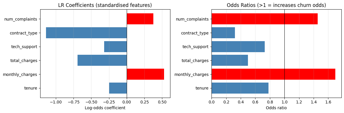
Top risk factors (odds ratios):
  monthly_charges: OR=1.696 — 1 SD increase INCREASES churn odds by 70%
  num_complaints: OR=1.457 — 1 SD increase INCREASES churn odds by 46%
  tenure: OR=0.780 — 1 SD increase decreases churn odds by 22%
  tech_support: OR=0.729 — 1 SD increase decreases churn odds by 27%
  total_charges: OR=0.499 — 1 SD increase decreases churn odds by 50%
  contract_type: OR=0.320 — 1 SD increase decreases churn odds by 68%
Knowledge Check
Why should a churn-prediction lab inspect both predicted labels and predicted probabilities?
What is the value of checking a confusion matrix in the lab?
In the SuperTel business value model, why might the threshold that maximises business EV differ from the threshold that maximises F1?
Lab Extensions
Extension 1 — Add a Decision Tree
Add sklearn.tree.DecisionTreeClassifier to the model comparison. Does it outperform Logistic Regression on AUC-PR? What does its confusion matrix look like at the F1-optimal threshold?
%matplotlib inline
# Extension 1: add Decision Tree to comparison
# Your code here
Extension 2 — Feature Importance
Using the Random Forest model, extract and plot feature importances. Compare them to the logistic regression odds ratios. Do the two models agree on which features drive churn?
%matplotlib inline
# Extension 2: Random Forest feature importance vs LR odds ratios
# Your code here
Business Recommendation Template
Based on your model results, complete the template below:
Model choice: [Logistic Regression / Gaussian NB / Random Forest] achieved the best [AUC-PR / F1 / EV] of [value] on the test set.
Recommended threshold: [value], which yields Precision=[x], Recall=[y] and expected monthly business value of GBP [z].
Key churn drivers: [feature 1] (OR=[x]) and [feature 2] (OR=[y]) are the strongest predictors. Customers with [insight] are [N]x more likely to churn.
Recommended action: Contact the top [N]% of customers by predicted churn probability with a retention offer.
What’s Next?
Chapter 7 is complete. Chapter 8 introduces Support Vector Machines — a fundamentally different approach to classification that maximises the margin between classes rather than fitting probabilities.
SVM Basics — max-margin intuition, support vectors, the quadratic programming problem
Kernel SVMs — the kernel trick, RBF and polynomial kernels
Soft Margin & Regularisation — the C parameter, hinge loss, primal vs dual