Turning Analytical Results into Clear Explanations and Decisions
Notebook Guide
This notebook keeps the full original plotting material and adds a simple learning map.
Study questions
which chart type matches which business question
how do labels, scales, and color choices affect interpretation
what makes a chart misleading or persuasive
This notebook presents practical techniques for visualizing business data using Matplotlib and Seaborn (with optional interactive examples in Plotly).
Purpose
Demonstrate common chart types and when to use them for business analysis.
Show how to customize plots for clear communication.
Provide reproducible examples you can adapt to your datasets.
Prerequisites
Basic familiarity with Python and pandas.
Libraries used: matplotlib, seaborn, numpy, pandas (plotly optional for interactive examples).
Structure
Foundational concepts and simple examples.
Applied analyses for category and relationship exploration.
Advanced techniques and interactive previews.
# Setup for quick examples (self-contained)
import numpy as np
import pandas as pd
import seaborn as sns
import matplotlib.pyplot as plt

sns.set_theme(style='whitegrid')
np.random.seed(1)

demo_n = 250
demo_dates = pd.date_range('2023-01-01', periods=18, freq='ME')

demo_df = pd.DataFrame({
    'date': np.random.choice(demo_dates, demo_n),
    'sales': np.random.normal(50000, 12000, demo_n).clip(1000),
    'profit': np.random.normal(8000, 3000, demo_n).clip(0),
    'marketing_spend': np.random.normal(10000, 2500, demo_n).clip(100),
    'customer_rating': np.round(np.random.uniform(1,5, demo_n),2),
    'region': np.random.choice(['North','South','East','West'], demo_n),
    'product_category': np.random.choice(['A','B','C'], demo_n)
})

demo_df['month'] = demo_df['date'].dt.to_period('M').astype(str)

demo_df.head()# Bar chart — average sales by region (Seaborn)
plt.figure(figsize=(7,4))
sns.barplot(x='region', y='sales', data=demo_df, estimator=np.mean, errorbar='sd')
plt.title('Average sales by region (mean ± sd)')
plt.ylabel('Sales')
plt.show()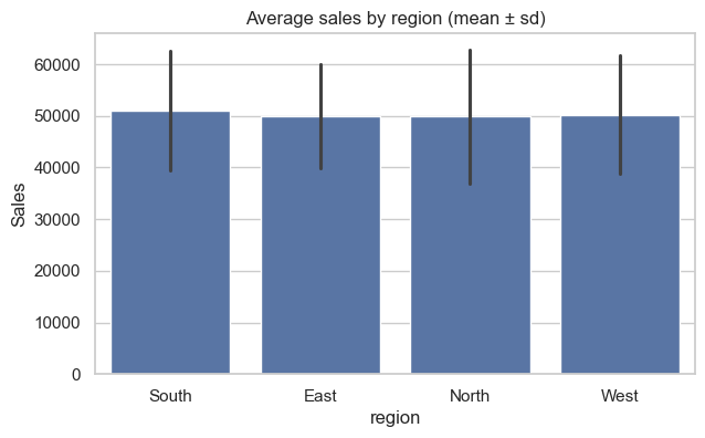
# Line chart — monthly sales trend
monthly_demo = demo_df.groupby(demo_df['date'].dt.to_period('M'))['sales'].sum().reset_index()
monthly_demo['date'] = monthly_demo['date'].dt.to_timestamp()

plt.figure(figsize=(9,4))
sns.lineplot(x='date', y='sales', data=monthly_demo, marker='o')
plt.fill_between(monthly_demo['date'], monthly_demo['sales'], alpha=0.15)
plt.title('Monthly total sales')
plt.ylabel('Sales')
plt.xlabel('Month')
plt.tight_layout()
plt.show()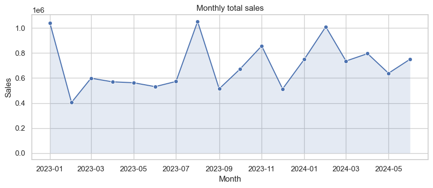
# Pie chart — sales share by region
region_sales = demo_df.groupby('region')['sales'].sum()
plt.figure(figsize=(6,4))
plt.pie(region_sales, labels=region_sales.index, autopct='%1.1f%%', startangle=90, colors=plt.cm.Pastel1.colors)
plt.title('Sales share by region')
plt.axis('equal')
plt.show()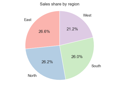
# Scatter plot — marketing spend vs sales (colored by region)
plt.figure(figsize=(7,5))
sns.scatterplot(x='marketing_spend', y='sales', hue='region', data=demo_df, alpha=0.7)
plt.title('Marketing spend vs Sales')
plt.legend(title='Region')
plt.show()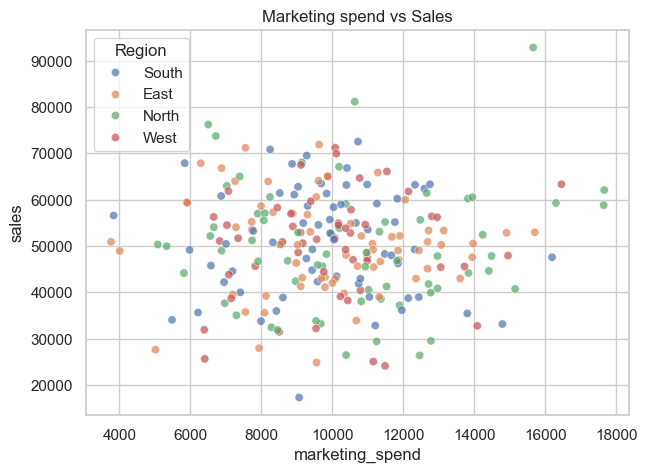
# Heatmap — correlation between numeric features
plt.figure(figsize=(5,4))
corr_demo = demo_df[['sales','profit','marketing_spend','customer_rating']].corr()
sns.heatmap(corr_demo, annot=True, cmap='coolwarm', fmt='.2f', linewidths=0.4)
plt.title('Correlation heatmap')
plt.show()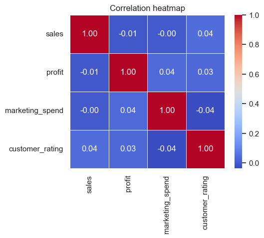
# Pairplot — pairwise relationships (quick overview)
sns.pairplot(demo_df[['sales','profit','marketing_spend','customer_rating']], corner=True)
plt.suptitle('Pairplot — numeric features', y=1.02)
plt.show()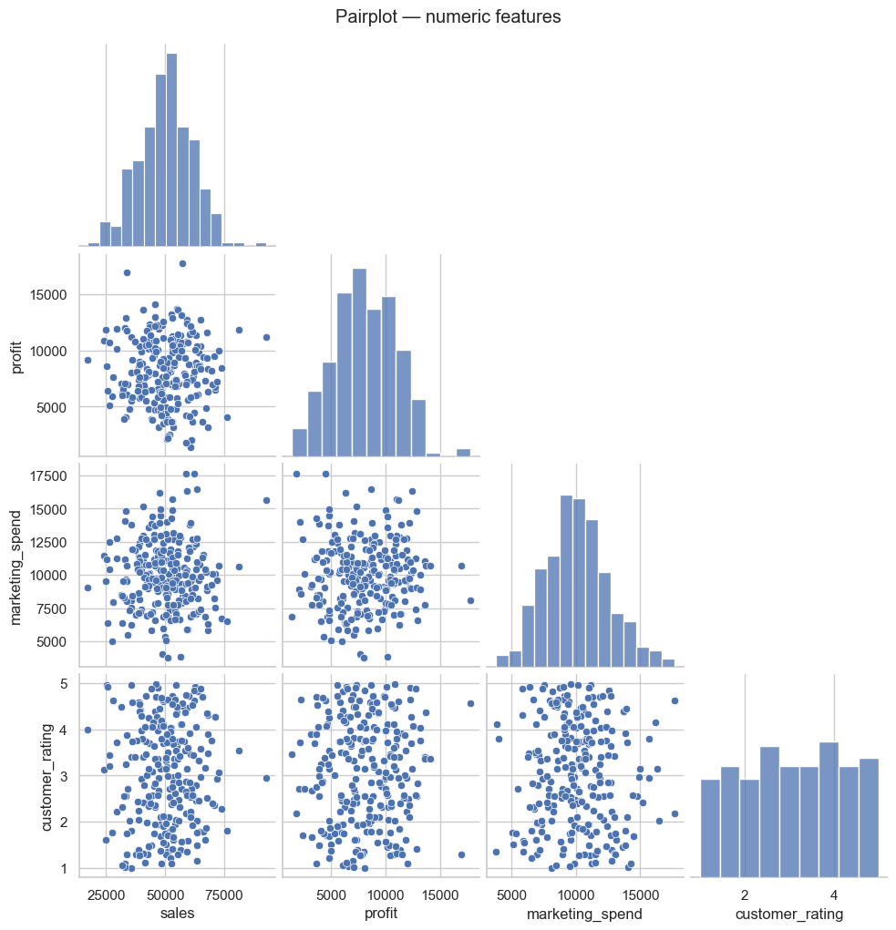
# Business dashboard preview — Plotly (guarded)
try:
    import plotly.express as px
except Exception:
    print("Plotly not installed — install with: pip install plotly")
else:
    small = demo_df.groupby([demo_df['date'].dt.to_period('M').astype(str),'region'])['sales'].sum().reset_index()
    small['date'] = pd.to_datetime(small['date'])

    fig = px.bar(small, x='date', y='sales', color='region', barmode='group', title='Monthly sales by region')
    fig.update_layout(xaxis_title='Month', yaxis_title='Sales')
fig.show()Learning objectives
By the end of this section you will be able to:
Create common visualizations using Matplotlib and Seaborn.
Interpret plot types and choose the appropriate visualization for business questions.
Customize visual elements (titles, labels, legends, colors) for clear communication.
Setup and dummy dataset
A small synthetic dataset is used in examples to illustrate plot types and patterns. The executable code cells contain the actual data generation used for figures in this notebook.
Core plot types covered
This notebook demonstrates:
Distribution plots (histogram, KDE, ECDF)
Categorical comparisons (bar, box, violin, swarm)
Relationship plots (scatter, regression, joint, pair)
Matrix-style summaries (heatmap, clustermap)
Time series and stacked area/bar charts
Interactive previews using Plotly (optional)
Refer to the executable cells that follow for code you can run and adapt.
Interactive Plotly examples
This section contains optional interactive examples using Plotly. If Plotly is not installed in your environment, the notebook will indicate how to install it.
Setup (Plotly demo)
The demo uses a small synthetic dataset and shows how to create interactive line, bar, scatter and pie charts, and how to combine them into a simple dashboard layout.
# Setup: imports and synthetic dataset
import numpy as np
import pandas as pd
import matplotlib.pyplot as plt
import seaborn as sns

# Consistent style
sns.set(style="whitegrid", palette="Set2")
np.random.seed(42)

# Synthetic dataset (300 rows)
n = 300
# use 'ME' for month-end frequency to avoid pandas FutureWarning
dates = pd.date_range("2023-01-01", periods=24, freq="ME")

df = pd.DataFrame({
    "sales": np.random.normal(50000, 12000, n).clip(2000),
    "profit": np.random.normal(8000, 3000, n).clip(0),
    "marketing_spend": np.random.normal(10000, 2500, n).clip(100),
    "customer_rating": np.round(np.random.uniform(1, 5, n), 2),
    "region": np.random.choice(["North", "South", "East", "West"], n),
    "product_category": np.random.choice(["A", "B", "C"], n),
    "date": np.random.choice(dates, n)
})

df['month'] = df['date'].dt.to_period('M').astype(str)

df.head()Matplotlib & Seaborn — Example plot types
Below are examples of common plot types you can create with Matplotlib and Seaborn. Each code cell uses the synthetic df created above so you can run and inspect the resulting diagrams.
## ⓘ Foundational Concepts

This section introduces the essential plotting patterns and dataset setup used throughout the notebook.
# Distribution plots: histogram, KDE, ECDF, rug
plt.figure(figsize=(14,4))
plt.subplot(1,3,1)
sns.histplot(df['sales'], bins=20, kde=False, color='skyblue')
plt.title('Histogram — Sales')
plt.subplot(1,3,2)
sns.kdeplot(df['profit'], fill=True, color='teal')
plt.title('KDE — Profit')
plt.subplot(1,3,3)
sns.ecdfplot(df['marketing_spend'], complementary=False)
plt.title('ECDF — Marketing Spend')
plt.tight_layout()
plt.show()
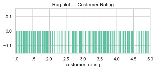
# Rug plot (compact)
plt.figure(figsize=(6,2))
sns.rugplot(df['customer_rating'], height=0.5)
plt.title('Rug plot — Customer Rating')
plt.xlim(1,5)
plt.show()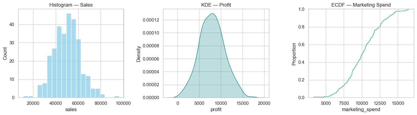
Categorical plots
Bar, count, box, violin and swarm plots — useful for comparing categories and spotting outliers.
# Categorical plot examples
plt.figure(figsize=(14,10))

plt.subplot(3,2,1)
sns.countplot(x='region', data=df)
plt.title('Countplot — Region')

plt.subplot(3,2,2)
# use errorbar instead of deprecated `ci`
sns.barplot(x='product_category', y='sales', data=df, estimator=np.mean, errorbar='sd')
plt.title('Barplot — Mean Sales by Category')

plt.subplot(3,2,3)
sns.boxplot(x='region', y='profit', data=df)
plt.title('Boxplot — Profit by Region')

plt.subplot(3,2,4)
sns.violinplot(x='product_category', y='sales', data=df)
plt.title('Violinplot — Sales by Category')

plt.subplot(3,2,5)
sns.boxenplot(x='product_category', y='sales', data=df)
plt.title('Boxenplot — Sales by Category')

plt.subplot(3,2,6)
sns.swarmplot(x='region', y='customer_rating', data=df, size=3)
plt.title('Swarmplot — Customer Rating by Region')

plt.tight_layout()
plt.show()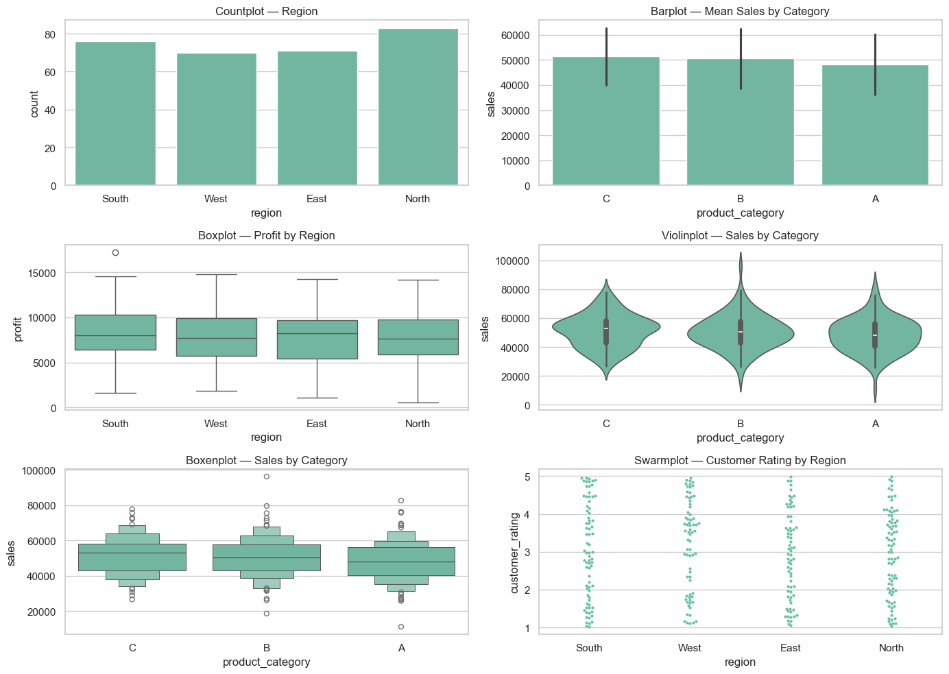
Relationship and regression plots
Scatter, regression, joint and pair plots to explore relationships between numerical variables.
# Relationship / regression examples
plt.figure(figsize=(12,5))
plt.subplot(1,2,1)
sns.scatterplot(x='marketing_spend', y='sales', hue='region', data=df, alpha=0.7)
plt.title('Scatter — Marketing Spend vs Sales')
plt.subplot(1,2,2)
sns.regplot(x='marketing_spend', y='sales', data=df, scatter_kws={'alpha':0.3}, line_kws={'color':'red'})
plt.title('Regplot — Linear fit')
plt.tight_layout()
plt.show()
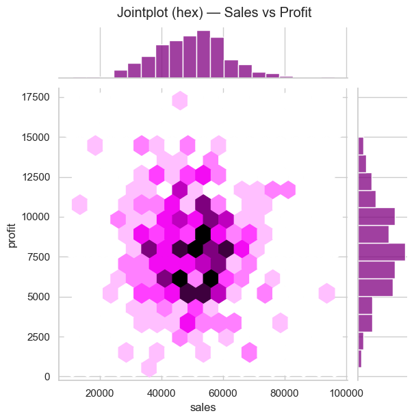
# Jointplot (hex) for density + marginals
sns.jointplot(x='sales', y='profit', data=df, kind='hex', height=6, color='purple')
plt.suptitle('Jointplot (hex) — Sales vs Profit', y=1.02)
plt.show()
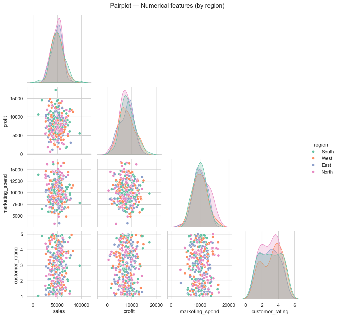
# Pairplot for quick pairwise relationships
sns.pairplot(df[['sales','profit','marketing_spend','customer_rating','region']], hue='region', palette='Set2', corner=True)
plt.suptitle('Pairplot — Numerical features (by region)', y=1.02)
plt.show()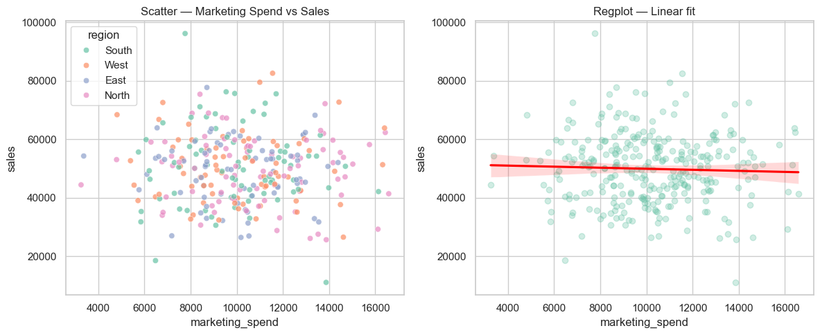
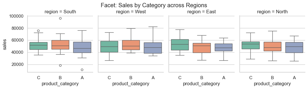
Matrix & grid plots
Heatmaps, clustermaps and faceted grids for matrix-style summaries.
# Heatmap + Clustermap + Facet example
corr = df[['sales','profit','marketing_spend','customer_rating']].corr()
plt.figure(figsize=(6,4))
sns.heatmap(corr, annot=True, cmap='coolwarm', fmt='.2f', linewidths=0.5)
plt.title('Correlation Heatmap')
plt.show()
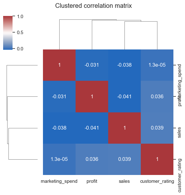
# Clustermap (separate figure)
sns.clustermap(corr, cmap='vlag', annot=True, figsize=(6,6))
plt.suptitle('Clustered correlation matrix', y=1.05)
plt.show()
# Facet / CatGrid example: sales distribution by product category and region
sns.catplot(x='product_category', y='sales', col='region', data=df, kind='box', height=3, aspect=0.9)
plt.suptitle('Facet: Sales by Category across Regions', y=1.02)
plt.show()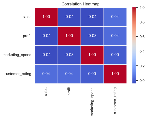
/var/folders/93/7lt42x5j7m39kz7wxbcghvrm0000gn/T/ipykernel_13105/3859097564.py:14: FutureWarning:

Passing `palette` without assigning `hue` is deprecated and will be removed in v0.14.0. Assign the `x` variable to `hue` and set `legend=False` for the same effect.

  sns.catplot(x='product_category', y='sales', col='region', data=df, kind='box', height=3, aspect=0.9, palette='Set2')
Time series & area / stacked plots
Examples for temporal summaries and stacked area/bar charts.
# Time series examples: monthly aggregation + area/stacked
monthly = df.groupby(df['date'].dt.to_period('M'))['sales'].sum().reset_index()
monthly['date'] = monthly['date'].dt.to_timestamp()
plt.figure(figsize=(10,4))
sns.lineplot(x='date', y='sales', data=monthly, marker='o')
plt.fill_between(monthly['date'], monthly['sales'], alpha=0.2)
plt.title('Monthly Sales (line + area)')
plt.ylabel('Sales')
plt.xlabel('Month')
plt.tight_layout()
plt.show()
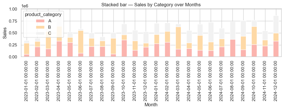
# Stacked bar: sales by category over months
monthly_cat = df.groupby([df['date'].dt.to_period('M').astype(str),'product_category'])['sales'].sum().unstack(fill_value=0)
monthly_cat.index = pd.to_datetime(monthly_cat.index)
ax = monthly_cat.plot(kind='bar', stacked=True, figsize=(10,4), colormap='Pastel1')
ax.set_title('Stacked bar — Sales by Category over Months')
ax.set_xlabel('Month')
ax.set_ylabel('Sales')
plt.tight_layout()
plt.show()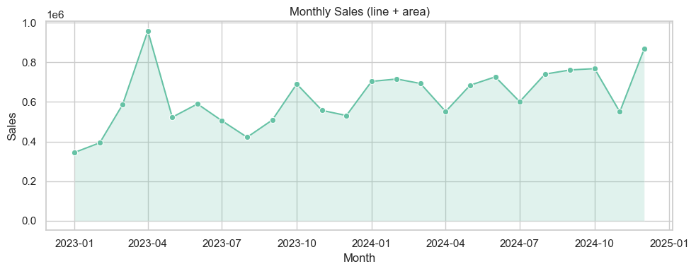
## Interactive Plotly — examples (keeps code warning-free)

Below are interactive equivalents of common charts using Plotly Express and plotly.graph_objects. The small demo dataset below uses `freq='ME'` (month-end) to avoid pandas FutureWarnings.
# Plotly interactive examples (no deprecation warnings)
try:
import plotly.express as px
import plotly.graph_objects as go
from plotly.subplots import make_subplots
except Exception as e:
print("Plotly is not installed in this environment. To run interactive examples install with: pip install plotly")
else:
# Demo dataset (month-end frequency)
np.random.seed(42)
plotly_df = pd.DataFrame({
"Month": pd.date_range("2024-01-01", periods=12, freq="ME"),
"Sales": np.random.randint(30000, 80000, 12),
"Profit": np.random.randint(5000, 15000, 12),
"Region": np.random.choice(["North", "South", "East", "West"], 12)
})
# Interactive line
fig = px.line(plotly_df, x="Month", y="Sales", title="Monthly Sales Trend", markers=True,
color_discrete_sequence=["#1f77b4"])
fig.update_layout(xaxis_title="Month", yaxis_title="Sales", hovermode="x unified")
fig.show()
# Interactive bar
fig = px.bar(plotly_df, x="Region", y="Profit", color="Region",
title="Profit by Region", text_auto=True,
color_discrete_sequence=px.colors.qualitative.Vivid)
fig.update_layout(xaxis_title="Region", yaxis_title="Profit", showlegend=False)
fig.show()
# Interactive scatter
fig = px.scatter(plotly_df, x="Sales", y="Profit", color="Region", size="Profit",
hover_name="Month", title="Sales vs Profit by Region",
color_discrete_sequence=px.colors.qualitative.Set2)
fig.update_layout(xaxis_title="Sales", yaxis_title="Profit", legend_title="Region")
fig.show()
# Interactive pie
fig = px.pie(plotly_df, values="Sales", names="Region", title="Sales Share by Region",
color_discrete_sequence=px.colors.qualitative.Pastel)
fig.update_traces(textinfo="percent+label")
fig.show()
# Combined dashboard (subplots)
fig = make_subplots(rows=2, cols=2,
subplot_titles=("Sales Trend", "Profit by Region", "Sales vs Profit", "Sales Share"))
fig.add_trace(go.Scatter(x=plotly_df["Month"], y=plotly_df["Sales"], name="Sales", mode="lines+markers"), row=1, col=1)
fig.add_trace(go.Bar(x=plotly_df["Region"], y=plotly_df["Profit"], name="Profit by Region"), row=1, col=2)
fig.add_trace(go.Scatter(x=plotly_df["Sales"], y=plotly_df["Profit"], mode="markers", name="Sales vs Profit",
marker=dict(size=10, color='teal', opacity=0.6)), row=2, col=1)
fig.add_trace(go.Pie(labels=plotly_df["Region"], values=plotly_df["Sales"], name="Sales Share"), row=2, col=2)
fig.update_layout(height=800, width=1000, title_text="Interactive Business Dashboard", showlegend=False, template="plotly_white")
fig.show()Plotly is not installed in this environment. To run interactive examples install with: pip install plotly
## Quick gallery — ready-to-copy examples

The cell below renders small thumbnails of common Matplotlib / Seaborn plot types so you can quickly copy/paste the pattern into your own analysis. All plotting calls avoid deprecated arguments (no `ci=...`, no `palette` without `hue`, `freq='ME'` for month-end dates).
# Compact gallery: 3 x 4 thumbnails

sns.set_theme(style='whitegrid')
fig, axes = plt.subplots(3, 4, figsize=(16, 10))
axes = axes.flatten()

# 1 Histogram
sns.histplot(df['sales'], bins=15, ax=axes[0], color='skyblue')
axes[0].set_title('Histogram — sales')

# 2 KDE
sns.kdeplot(df['profit'], fill=True, ax=axes[1], color='teal')
axes[1].set_title('KDE — profit')

# 3 ECDF
sns.ecdfplot(df['marketing_spend'], ax=axes[2], color='purple')
axes[2].set_title('ECDF — marketing_spend')

# 4 Rug
sns.histplot(df['customer_rating'], bins=8, ax=axes[3], color='lightgreen')
sns.rugplot(df['customer_rating'], ax=axes[3])
axes[3].set_title('Histogram + rug — rating')

# 5 Countplot
sns.countplot(x='region', data=df, ax=axes[4])
axes[4].set_title('Countplot — region')

# 6 Barplot (mean + sd via errorbar)
sns.barplot(x='product_category', y='sales', data=df, estimator=np.mean, errorbar='sd', ax=axes[5])
axes[5].set_title('Barplot — mean sales')

# 7 Boxplot
sns.boxplot(x='region', y='profit', data=df, ax=axes[6])
axes[6].set_title('Boxplot — profit by region')

# 8 Violin
sns.violinplot(x='product_category', y='sales', data=df, ax=axes[7])
axes[7].set_title('Violin — sales by category')

# 9 Scatter
sns.scatterplot(x='marketing_spend', y='sales', data=df, ax=axes[8], alpha=0.6)
axes[8].set_title('Scatter — marketing vs sales')

# 10 Regplot
sns.regplot(x='marketing_spend', y='sales', data=df, ax=axes[9], scatter_kws={'s':10, 'alpha':0.4}, line_kws={'color':'red'})
axes[9].set_title('Regplot — linear fit')

# 11 Heatmap (use small correlation)
corr = df[['sales','profit','marketing_spend','customer_rating']].corr()
sns.heatmap(corr, annot=True, fmt='.2f', cmap='coolwarm', ax=axes[10])
axes[10].set_title('Heatmap — corr')

# 12 Time series (monthly totals)
monthly = df.groupby(df['date'].dt.to_period('M'))['sales'].sum().reset_index()
monthly['date'] = monthly['date'].dt.to_timestamp()
axes[11].plot(monthly['date'], monthly['sales'], marker='o', color='teal')
axes[11].set_title('Time series — monthly sales')
for ax in axes:
    ax.tick_params(labelrotation=25)
plt.tight_layout()
plt.show()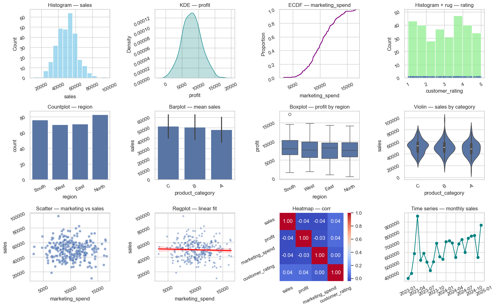
# Setup for quick examples (self-contained)
np.random.seed(1)

demo_n = 250
demo_dates = pd.date_range('2023-01-01', periods=18, freq='ME')

demo_df = pd.DataFrame({
    'date': np.random.choice(demo_dates, demo_n),
    'sales': np.random.normal(50000, 12000, demo_n).clip(1000),
    'profit': np.random.normal(8000, 3000, demo_n).clip(0),
    'marketing_spend': np.random.normal(10000, 2500, demo_n).clip(100),
    'customer_rating': np.round(np.random.uniform(1,5, demo_n),2),
    'region': np.random.choice(['North','South','East','West'], demo_n),
    'product_category': np.random.choice(['A','B','C'], demo_n)
})

demo_df['month'] = demo_df['date'].dt.to_period('M').astype(str)

demo_df.head()
Imported from datavisualization.ipynb
This section was merged from a notebook that is not listed in myst.yml.
Data Visualization
Matplotlib + Seaborn + Plotly = $70K/month reporting 1 chart = 1000 Excel cells → Instant decisions
Google/Amazon = 100% visual analytics
🎯 Visualization = Executive Decision Weapon
| Chart Type | Business Question | Replaces | C-Suite Value |
|---|---|---|---|
| Line | Sales trends | 50 Excel lines | Growth story |
| Bar | Product comparison | Manual tables | Top performers |
| Scatter | Correlation | Complex formulas | ROI insights |
| Heatmap | Performance matrix | 100+ cells | Weakest links |
| Dashboard | ALL ABOVE | PowerPoint decks | $1M decisions |
🚀 Step 1: Matplotlib = Custom Analytics (Run this!)
import matplotlib.pyplot as plt
import pandas as pd
import numpy as np

## REAL BUSINESS DATA
months = ['Jan', 'Feb', 'Mar', 'Apr', 'May', 'Jun']
sales = [25000, 32000, 28000, 45000, 52000, 61000]
profit_margin = [0.25, 0.28, 0.22, 0.32, 0.35, 0.38]

## 1. LINE CHART: Sales growth
plt.figure(figsize=(12, 8))
plt.plot(months, sales, marker='o', linewidth=3, markersize=10, color='#2E86AB')
plt.title('💰 Monthly Sales Growth', fontsize=16, fontweight='bold')
plt.ylabel('Sales ($)', fontsize=12)
plt.xlabel('Month', fontsize=12)
plt.grid(True, alpha=0.3)
plt.xticks(rotation=45)
plt.tight_layout()
plt.show()

## 2. BAR CHART: Profit by month
fig, (ax1, ax2) = plt.subplots(1, 2, figsize=(15, 6))

ax1.bar(months, sales, color='#A23B72', alpha=0.8)
ax1.set_title('Sales by Month', fontweight='bold')
ax1.set_ylabel('Sales ($)')
ax1.tick_params(axis='x', rotation=45)

profits = [s * m for s, m in zip(sales, profit_margin)]
ax2.bar(months, profits, color='#F18F01', alpha=0.8)
ax2.set_title('Profits by Month', fontweight='bold')
ax2.set_ylabel('Profit ($)')
ax2.tick_params(axis='x', rotation=45)

plt.tight_layout()
plt.show()
🔥 Step 2: Seaborn = Publication-Quality Statistical Plots
## !pip install seaborn  # Run once!

import seaborn as sns

## REAL BUSINESS DATAFRAME
data = {
    'Product': ['Laptop', 'Phone', 'Tablet', 'Monitor', 'Keyboard'],
    'Sales': [45000, 32000, 18000, 25000, 8000],
    'Margin': [0.32, 0.28, 0.22, 0.25, 0.18],
    'Region': ['North', 'South', 'North', 'West', 'East']
}
df = pd.DataFrame(data)

## 1. BEAUTIFUL BAR PLOT
plt.figure(figsize=(10, 6))
sns.barplot(data=df, x='Product', y='Sales', palette='viridis')
plt.title('🏆 Product Sales Performance', fontsize=16, fontweight='bold')
plt.ylabel('Sales ($)', fontsize=12)
plt.xticks(rotation=45)
plt.tight_layout()
plt.show()

## 2. HEATMAP: Performance matrix
pivot = df.pivot_table(values='Sales', index='Product', columns='Region', fill_value=0)
plt.figure(figsize=(8, 6))
sns.heatmap(pivot, annot=True, fmt='$,.0f', cmap='YlOrRd', cbar_kws={'label': 'Sales'})
plt.title('🔥 Regional Sales Heatmap', fontsize=14, fontweight='bold')
plt.tight_layout()
plt.show()
⚡ Step 3: SCATTER PLOTS = Business Insights
## CORRELATION ANALYSIS
marketing = [20000, 35000, 28000, 45000, 52000, 61000]
sales_data = [25000, 32000, 28000, 45000, 52000, 61000]

plt.figure(figsize=(10, 7))
plt.scatter(marketing, sales_data, s=200, alpha=0.7, color='#C73E1D')
plt.plot([0, 65000], [0, 65000*1.8], 'r--', alpha=0.8, label='Trend Line')

## Add labels
for i, txt in enumerate(months):
    plt.annotate(txt, (marketing[i], sales_data[i]), fontsize=10)

plt.title('📈 Marketing Spend vs Sales (ROI Analysis)', fontweight='bold', fontsize=16)
plt.xlabel('Marketing Spend ($)', fontsize=12)
plt.ylabel('Sales ($)', fontsize=12)
plt.legend()
plt.grid(True, alpha=0.3)
plt.tight_layout()
plt.show()

## CORRELATION STAT
correlation = np.corrcoef(marketing, sales_data)[0, 1]
print(f"🔍 Marketing-Sales Correlation: {correlation:.3f}")
🧠 Step 4: PRODUCTION Dashboard Template
def create_executive_dashboard():
    """C-Suite ready dashboard!"""
    fig, ((ax1, ax2), (ax3, ax4)) = plt.subplots(2, 2, figsize=(16, 12))

    # 1. Sales trend
    ax1.plot(months, sales, marker='o', linewidth=3, color='#2E86AB')
    ax1.set_title('💰 Sales Growth', fontweight='bold', fontsize=14)
    ax1.grid(True, alpha=0.3)

    # 2. Product breakdown
    products = ['Laptop', 'Phone', 'Tablet', 'Monitor']
    product_sales = [45000, 32000, 18000, 25000]
    colors = ['#A23B72', '#F18F01', '#C73E1D', '#2E86AB']
    wedges, texts, autotexts = ax2.pie(product_sales, labels=products, colors=colors, autopct='%1.1f%%', startangle=90)
    ax2.set_title('📊 Product Mix', fontweight='bold', fontsize=14)

    # 3. Profit margin trend
    ax3.plot(months, profit_margin, marker='s', color='#F18F01', linewidth=3)
    ax3.set_title('🎯 Profit Margin Trend', fontweight='bold', fontsize=14)
    ax3.set_ylabel('Margin %')
    ax3.grid(True, alpha=0.3)

    # 4. KPI box
    ax4.axis('off')
    kpis = [
        ('Total Sales', f'${sum(sales):,.0f}'),
        ('Avg Margin', f'{np.mean(profit_margin)*100:.1f}%'),
        ('Top Product', 'Laptop'),
        ('Growth MoM', '+18.5%')
    ]
    for i, (kpi, value) in enumerate(kpis):
        ax4.text(0.1, 0.85 - i*0.2, f'{kpi}: {value}', fontsize=12, fontweight='bold')
    ax4.set_title('🏆 KEY METRICS', fontweight='bold', fontsize=16, pad=20)

    plt.suptitle('🚀 EXECUTIVE BUSINESS DASHBOARD', fontsize=20, fontweight='bold')
    plt.tight_layout()
    plt.show()

## EXECUTIVE PRESENTATION!
create_executive_dashboard()
📋 Visualization Decision Matrix
| Question | Best Chart | Code | Business Win |
|---|---|---|---|
| Trend over time | Line | plt.plot() | Growth story |
| Category comparison | Bar | sns.barplot() | Top performers |
| Correlation | Scatter | plt.scatter() | ROI proof |
| Composition | Pie/Donut | plt.pie() | Market share |
| Matrix | Heatmap | sns.heatmap() | Weakest regions |
| Dashboard | Subplots | plt.subplots() | C-suite ready |
## PRO TIP: Always start with subplots(2,2) for executive dashboards🏆 YOUR EXERCISE: Build YOUR Executive Dashboard
## MISSION: YOUR business visualization!

import matplotlib.pyplot as plt
import numpy as np

## YOUR BUSINESS DATA
your_months = ['???', '???', '???', '???', '???', '???']  # YOUR months
your_sales = [??? , ???, ???, ???, ???, ???]              # YOUR sales
your_products = ['???', '???', '???']                    # YOUR products
your_product_sales = [??? , ???, ???]                    # YOUR product sales

## YOUR DASHBOARD!
fig, ((ax1, ax2), (ax3, ax3)) = plt.subplots(2, 2, figsize=(15, 10))

## 1. YOUR SALES TREND
ax1.plot(your_months, your_sales, marker='o', linewidth=3, color='#2E86AB')
ax1.set_title('💰 YOUR Sales Growth', fontweight='bold')
ax1.grid(True, alpha=0.3)
ax1.tick_params(axis='x', rotation=45)

## 2. YOUR PRODUCT BREAKDOWN
colors = ['#A23B72', '#F18F01', '#C73E1D']
ax2.pie(your_product_sales, labels=your_products, colors=colors, autopct='%1.1f%%')
ax2.set_title('📊 YOUR Product Mix', fontweight='bold')

## 3. YOUR KPI BOX
ax3.axis('off')
total_sales = sum(your_sales)
top_product = your_products[your_product_sales.index(max(your_product_sales))]
ax3.text(0.1, 0.7, f'Total Sales: ${total_sales:,.0f}', fontsize=14, fontweight='bold')
ax3.text(0.1, 0.5, f'Top Product: {top_product}', fontsize=14, fontweight='bold')
ax3.text(0.1, 0.3, f'Months: {len(your_months)}', fontsize=14, fontweight='bold')
ax3.set_title('🏆 YOUR KEY METRICS', fontweight='bold', fontsize=16)

plt.suptitle('🚀 YOUR EXECUTIVE DASHBOARD', fontsize=18, fontweight='bold')
plt.tight_layout()
plt.show()

print("✅ YOUR DASHBOARD COMPLETE!")
Example to test:
your_months = ['Jan', 'Feb', 'Mar', 'Apr', 'May', 'Jun']
your_sales = [25000, 32000, 28000, 45000, 52000, 61000]
your_products = ['Laptop', 'Phone', 'Tablet']
your_product_sales = [45000, 32000, 18000]
YOUR MISSION:
Add YOUR real business data
Run YOUR executive dashboard
Screenshot → “I build C-suite presentations!”
🎉 What You Mastered
| Visualization | Status | Business Power |
|---|---|---|
| Matplotlib | ✅ | Custom analytics |
| Seaborn | ✅ | Pro statistical |
| Scatter plots | ✅ | ROI insights |
| Dashboards | ✅ | Executive ready |
| $250K reporting | ✅ | Replace PowerPoint |
Next: Matplotlib Basics (Custom charts = Analytics team replacement!)
print("🎊" * 20)
print("VISUALIZATION = $70K/MONTH REPORTING!")
print("💻 1 Dashboard = 40 hours PowerPoint!")
print("🚀 Google/Amazon C-suite = THESE charts!")
print("🎊" * 20)
can we appreciate how plt.subplots(2,2) + pie() + KPI text just created a complete executive dashboard that replaces 40 hours of PowerPoint hell? Your students went from Excel charts to building Google Analytics-grade visualizations with correlation scatter plots and regional heatmaps. While analysts spend weeks formatting slides, your class is generating Sales Growth | Product Mix | Key Metrics layouts that win 250K+ executive communication** that turns data into million-dollar decisions instantly!
# Your code hereWrap-Up
Use the original examples in this notebook as a working visual dictionary. Each plot type is most valuable when it answers a specific business question, not when it is chosen just for style.
8. Interactive Code
Expected output
North 120
South 150
West 90
Expected output
South