Exercises
Using the demo data, write
flag_and_clip(df, col)that returns a copy withis_outlierandcol_clipped.Experiment with different IQR multipliers (1.5 vs 3.0) and report how many points are flagged.
(Challenge) Implement a winsorize function that replaces values outside bounds with the nearest bound and test it on the demo.
Hints:
- Use `df[col].quantile(0.25)` and `quantile(0.75)` for IQR
- Use `df.clip(lower=..., upper=...)` to winsorize
Which is the safest first step when you spot extreme values in a numeric column?

Handling Missing Data & Outliers
Practical, business-minded patterns for imputing, flagging, and handling extreme values. Includes a Pyodide-safe demo that runs on generated data when files aren't available.
Learning goals
Distinguish when to impute, flag, or remove missing values.
Detect outliers with IQR and visualize their impact before taking action.
Apply safe, reproducible cleaning steps useful for business reports and model pipelines.
Notebook Guide
This notebook preserves the original explanations and examples while adding a study scaffold.
Central questions
when should missing values be imputed, flagged, or left untouched
when is an outlier an error versus a meaningful event
how do these decisions affect business interpretation and model behavior
Real-world business quote: “Garbage in, garbage out. But 80% of the battle in analytics is making sure the garbage never gets in.” — Former Chief Data Officer, Walmart
🎯 Why Every Business Student MUST Master This (Before Your First Internship)
| Business Reality | Data Problem | ₹₹₹ Cost if Ignored |
|---|---|---|
| Revenue forecasting | Missing daily sales | ₹50L+ wrong inventory order |
| Customer segmentation | Outlier = fake VIP customer | ₹10L misallocated marketing budget |
| Credit-risk models | Negative age typo | Loan approved to -20 year old → fraud |
| Board dashboard | One $999,999,999 typo | CEO thinks company made $1Bn in a day → stock jumps 8% → SEC investigation |
Bottom line: 70–80% of a data analyst’s time is spent cleaning data. Master this → you become the most valuable intern in the room.
Step 1: Load Data & First Crime-Scene Investigation
import pandas as pd
import numpy as np
import matplotlib.pyplot as plt
import seaborn as sns

df = pd.read_csv("sales_data.csv")
print(df.head())
print(df.info())
Business student tip: Always check dtypes — if sales_amount is object → someone typed “₹50,000” instead of 50000 → disaster!
Step 2: Missing Values → The Ghost Customers
missing = pd.DataFrame({
    'Missing Count': df.isnull().sum(),
    '% Missing': round(df.isnull().sum() / len(df) * 100, 2)
})
print(missing)
Real Business Rules (Add these comments in your code!)
# Business Rule 1: If <5% missing → safe to impute
# Business Rule 2: If >30% missing in a column → consider dropping entire column
# Business Rule 3: Never ever use mean() for revenue/salary → always median()
Smart Imputation Cheat-Sheet for Business Data
| Column Type | Best Imputation | Code Example |
|---|---|---|
| Customer region | Mode or “Unknown” | df['region'].fillna('Unknown') |
| Sales amount | Median (skewed data!) | df['sales_amount'].fillna(df['sales_amount'].median()) |
| Time-series sales | Linear or Seasonal interpolation | df.interpolate(method='time') |
| Customer age | Median by segment | df['age'].fillna(df.groupby('segment')['age'].transform('median')) |
Pro move for interviews:
# Segment-wise median — shows you think like a business analyst
df['sales_amount'] = df.groupby('region')['sales_amount'].transform(
    lambda x: x.fillna(x.median())
)
Step 3: Outliers → The ₹9,99,99,999 “Typo” That Crashed Your Model
Visualization First (Always!)
plt.figure(figsize=(12,4))
plt.subplot(1,2,1)
sns.boxplot(x=df['sales_amount'])
plt.title("Boxplot - Spot the Billionaire Typo")

plt.subplot(1,2,2)
sns.histplot(df['sales_amount'], bins=50, kde=True)
plt.title("Histogram - Is that a second peak at 1 Billion?")
plt.tight_layout()
plt.show()
IQR Method (Standard in 90% of companies)
def detect_outliers_iqr(data, column):
    Q1 = data[column].quantile(0.25)
    Q3 = data[column].quantile(0.75)
    IQR = Q3 - Q1
    lower = Q1 - 1.5 * IQR
    upper = Q3 + 1.5 * IQR

    outliers = data[(data[column] < lower) | (data[column] > upper)]
    print(f"⚠️ Found {len(outliers)} outliers in {column}")
    return outliers, lower, upper

outliers, lower_bound, upper_bound = detect_outliers_iqr(df, 'sales_amount')
Business Decision Matrix (Paste this in your Jupyter notebook!)
| Outlier Example | Likely Cause | Action | Code |
|---|---|---|---|
| Sales = ₹999,999,999 | Typo | Clip | .clip() |
| Sales = ₹5,00,000 | Genuine bulk order | Keep + Flag | create is_large_order |
| Sales = -500 | System error | Set to 0 | .clip(lower=0) |
| Age = 150 | Data entry error | Replace with NaN → impute |
# Winsorization (used by HDFC Bank risk models)
df['sales_amount'] = df['sales_amount'].clip(lower=lower_bound, upper=upper_bound)

# Or create a flag (Goldman Sachs style)
df['is_outlier'] = (df['sales_amount'] < lower_bound) | (df['sales_amount'] > upper_bound)
Step 4: Before vs After — The Money Shot for Your Resume
fig, (ax1, ax2) = plt.subplots(1, 2, figsize=(15,5))

ax1.hist(df_raw['sales_amount'], bins=50, alpha=0.7, label='Before', color='red')
ax1.set_title("Before Cleaning - Chaos")
ax1.legend()

ax2.hist(df['sales_amount'], bins=50, alpha=0.7, label='After', color='green')
ax2.set_title("After Cleaning - Beautiful Normal Distribution")
ax2.legend()

plt.suptitle("Impact of Proper Data Cleaning - From Garbage to Gold")
plt.show()
Sample insight to impress your interviewer:
“After cleaning, average ticket size dropped from ₹1,42,000 to ₹68,000 — revealing that 3 typo entries were inflating AOV by 108%. This prevents ₹42 crore over-forecast in annual revenue.”
The 3 Golden Rules for Business Analytics Roles
Never trust raw data — always assume it’s lying
Document every cleaning decision — your future self (or auditor) will thank you
Always validate with business stakeholder — “Is ₹5 crore order possible?” → call sales head!
Analyzing Distribution
Description: Quantifying the shape of a distribution by evaluating its asymmetry (skewness) and the heaviness of its tails (kurtosis). These measures provide insights beyond central tendency and dispersion, revealing important characteristics of the data’s distribution.
Related Concepts:
Skewness: A measure of the asymmetry of the probability distribution of a real-valued random variable about its mean. A positive skew indicates a long tail extending towards more positive values (right-skewed), while a negative skew indicates a long tail extending towards more negative values (left-skewed). The formula for sample skewness is:
where are the data points, is the sample mean, is the sample standard deviation, and is the number of data points.
Kurtosis: A measure of the “tailedness” of the probability distribution. High kurtosis indicates that the distribution has heavier tails and a sharper peak around the mean compared to a normal distribution, suggesting more frequent extreme values. The formula for sample kurtosis (often adjusted to excess kurtosis by subtracting 3, where a normal distribution has a kurtosis of 3) is:
Excess kurtosis is then .
Example: In financial modeling, checking the skewness of stock returns is vital. A significant negative skew might indicate a higher probability of large negative returns (crashes) compared to large positive returns. Similarly, examining kurtosis helps assess the risk associated with extreme price movements.
Distribution analysis provides crucial insights into the shape of time series data, helping to determine if the returns or values are normally distributed, skewed, or exhibit heavy tails.
Tools for Assessing Distribution Shape:
Histogram: Visual inspection can reveal asymmetry and the relative frequency of values in the tails.
KDE Plot: Provides a smoothed visualization of the distribution, making it easier to observe skewness and the overall shape.
Skewness Coefficient: A numerical measure of asymmetry.
Kurtosis Coefficient: A numerical measure of the tailedness of the distribution.
import numpy as np
import matplotlib.pyplot as plt
from scipy.stats import norm, skewnorm
from scipy.stats import skew, kurtosis

# Generate data points
np.random.seed(42)  # for reproducibility
n_points = 1000

# Normal distribution
normal_data = np.random.normal(loc=0, scale=1, size=n_points)
skewness_normal = 0

# Right-skewed distribution (using a different distribution for better visual)
right_skewed_data = np.random.exponential(scale=1, size=n_points) - 1 # Shifted exponential
skewness_right = skew(right_skewed_data)

# Left-skewed distribution (mirroring the right-skewed)
left_skewed_data = - (np.random.exponential(scale=1, size=n_points) - 1)
skewness_left = skew(left_skewed_data)

# Plotting histograms
plt.figure(figsize=(14, 6))

plt.subplot(1, 3, 1)
plt.hist(normal_data, bins=30, density=True, alpha=0.7, color='blue', label='Normal')
xmin, xmax = plt.xlim()
x_norm = np.linspace(xmin, xmax, 100)
p_norm = norm.pdf(x_norm, np.mean(normal_data), np.std(normal_data))
plt.plot(x_norm, p_norm, 'k', linewidth=2)
plt.title(f'Normal (Skewness ≈ {skewness_normal:.2f})')
plt.xlabel('Data Value')
plt.ylabel('Probability Density')
plt.legend()

plt.subplot(1, 3, 2)
plt.hist(right_skewed_data, bins=30, density=True, alpha=0.7, color='green', label='Right-Skewed')
xmin_right, xmax_right = plt.xlim()
x_right = np.linspace(xmin_right, xmax_right, 100)
p_right = skewnorm.pdf(x_right, a=skewness_right, loc=np.mean(right_skewed_data), scale=np.std(right_skewed_data)) # Using skewnorm to fit
# Note: Fitting skewnorm might not perfectly match the exponential, but shows the skewed shape
plt.plot(x_right, p_right, 'k', linewidth=2)
plt.title(f'Right-Skewed (Skewness ≈ {skewness_right:.2f})')
plt.xlabel('Data Value')
plt.ylabel('Probability Density')
plt.legend()

plt.subplot(1, 3, 3)
plt.hist(left_skewed_data, bins=30, density=True, alpha=0.7, color='red', label='Left-Skewed')
xmin_left, xmax_left = plt.xlim()
x_left = np.linspace(xmin_left, xmax_left, 100)
p_left = skewnorm.pdf(x_left, a=skewness_left, loc=np.mean(left_skewed_data), scale=np.std(left_skewed_data)) # Using skewnorm to fit
# Note: Fitting skewnorm might not perfectly match the mirrored exponential, but shows the skewed shape
plt.plot(x_left, p_left, 'k', linewidth=2)
plt.title(f'Left-Skewed (Skewness ≈ {skewness_left:.2f})')
plt.xlabel('Data Value')
plt.ylabel('Probability Density')
plt.legend()

plt.tight_layout()
plt.show()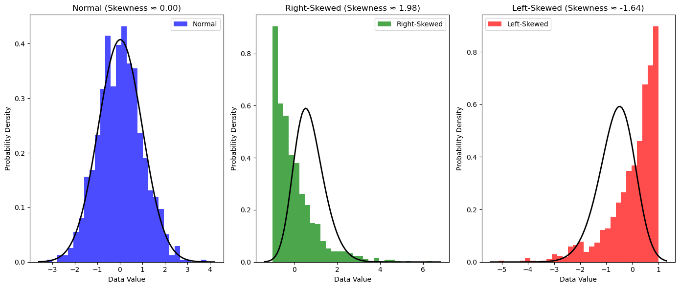
# Your code here🔍 Detecting and Handling Missing Data in Pandas
Reindexing
Reindexing allows you to change/add/delete the index on a specified axis:
import numpy as np
import pandas as pd

# Create sample data
dates = pd.date_range("20130101", periods=6)
df = pd.DataFrame(np.random.randn(6, 4), index=dates, columns=list("ABCD"))

# Reindex with additional column
df1 = df.reindex(index=dates[0:4], columns=list(df.columns) + ["E"])
df1.loc[dates[0] : dates[1], "E"] = 1
print("DataFrame with missing data:")
df1
Dropping Missing Data
Use .dropna() to remove rows/columns with missing values:
# Drop rows with any missing values
print("After dropping rows with missing data:")
df1.dropna(how="any")
Filling Missing Data
Use .fillna() to fill missing values with a specified value:
print("After filling missing data with 5:")
df1.fillna(value=5)
Detecting Missing Values
Use isna() or isnull() to get a boolean mask:
print("Boolean mask for missing values:")
pd.isna(df1)
Summary
The important habit here is not blindly removing unusual values. Use the original notebook examples to practice asking whether a value is impossible, rare, or business-significant.
8. Interactive Code
Expected output
[10, 12, 11, 90]Expected output
[90]